JavaScript Optimization for Enhancing Website Performance

Enhancing Website Performance with JavaScript

Think on clicking on a website and waiting for it to load. Frustrating, right? Well, that’s a problem many websites face, mainly because of how they use JavaScript. But what if I told you that JavaScript, slowing sites down, can also make them lightning-fast? That’s where enhancing website performance with JavaScript comes in.

We’re about to look into some cool tricks and tweaks that can turn a sluggish website into a speedy. These changes will make your site faster and make your visitors happier and more likely to stick around or come back for more.

Ready to speed up your site? Let’s do it.

What JavaScript Performance Causes Issues

JavaScript is pivotal in web development, enabling dynamic, interactive user experiences. However, its impact on performance is clear.

    • Download Size: Large JavaScript files slow webpage loading, especially on slow connections and mobile devices.
    • Parsing and Execution: Complex scripts delay browser processing, affecting page interactivity.
    • Blocking Behavior: JavaScript execution can stop page rendering, leading to visible delays.
    • DOM Manipulation: Inefficient script changes to the DOM can cause performance issues.
    • Memory Usage: Excessive JavaScript consumption can harm device performance and stability.

JavaScript Optimization Methods for  Enhancing Website Performance

Minimizing JavaScript Load

Reducing the size of JavaScript files and removing unnecessary code is crucial for improving website performance. Smaller files download and execute more quickly, reducing the time for a page to become interactive.

Minify and Compress: Minification removes all unnecessary characters from JavaScript files (like whitespace and comments), while compression reduces file size further.

Tools like UglifyJS or Terser can decrease JavaScript, and GZIP or Brotli compression can be applied on the server side.

Tree Shaking: This process eliminates unused code from your bundle. Modern JavaScript tools like Webpack and Rollup support tree shaking, helping to strip out unused functions and variables.

Module Bundling: Use module bundlers like Webpack or Rollup to combine multiple JavaScript files into a single bundle, reducing the number of HTTP requests needed to load resources.

Optimizing JavaScript Execution

How and when JavaScript perform can greatly enhance page performance, making the site feel faster and more responsive.

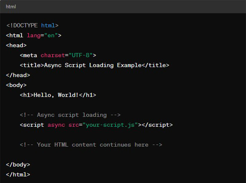
Deferred Loading: Defer the loading of JavaScript, which is not critical to the initial rendering of the page. The defer attribute in script tags tells the browser to carry out the script after parsing the HTML document.

Asynchronous Loading: Use the async attribute to load scripts asynchronously, allowing the browser to continue parsing and rendering the page without waiting for the script to load.

async attribute in HTML

Efficient Event Handling

Proper management of event handlers is vital to prevent unnecessary processing and potential memory leaks, which can affect performance.

Optimize Binding: Attach event handlers wisely; too many can slow down performance. Consider event delegation to minimize the number of handlers by catching events at a higher level in the DOM tree.

Throttle and Debounce: For events that fire rapidly (like scroll or resize), use throttling or debouncing. It ensures the function work at regular intervals or occurs only after a certain period of inactivity.

Improving Loop and Iteration Performance

Efficient loops and iterations can significantly reduce the action time of JavaScript, leading to faster, smoother website function.

Avoid unnecessary work inside loops and consider breaking out once the necessary condition is met to avoid processing extra iterations.

For data-intensive operations, apply appropriate structures like arrays or typed arrays for operations on data collections and objects or maps for quick lookups by key.

loop usage and data handling in JavaScript

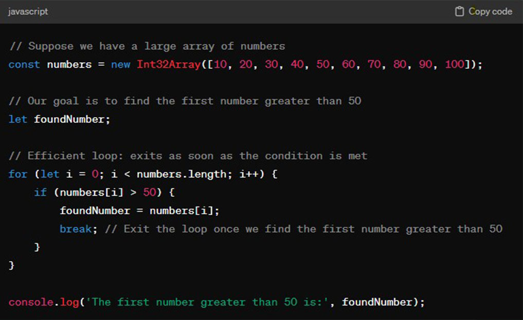
We use an Int32Array for numbers, a typed array that provides better performance for numerical data than regular arrays.

The loop checks each element of numbers and stops (with a break) as soon as it finds an element greater than 50, avoiding unnecessary work.

This approach minimizes the execution time, which is especially beneficial for large data sets.

Broader Techniques in JavaScript for Enhancing Website Performance

Leveraging Browser Caching

Browser caching is a mechanism that stores copies of web pages, images, and other resources on a user’s device.

When a user revisits a website, the browser can load these stored resources from the cache instead of downloading them again from the server. As a result, reduces load times and bandwidth usage.

To implement effective browser caching, set appropriate cache control headers on your server to specify how long browsers should store resources.

The benefits of browser caching include faster page loads for repeat visitors and reduced strain on your web server.

Using Content Delivery Networks (CDN)

CDNs distribute your website’s content across multiple geographically dispersed servers. When someone visits your website, a CDN ensures they get the information from a nearby server. This means the data has less distance to travel, making the website load faster for the visitor.

This decrease in latency results in faster loading times and a more responsive user experience.

CDNs also help handle traffic spikes and reduce the load on the origin server, enhancing your website’s overall scalability and reliability.

Optimizing Media Content

Modifying images and videos is crucial for improving website speed, as media files often comprise a significant portion of a web page’s size. You can apply techniques:

Compress Images and Videos: Use tools to reduce file size without noticeably affecting quality. For images, consider formats like JPEG, PNG, or WebP, and for videos, use efficient codecs like H.264 or VP9.

Responsive Images: Serve different image sizes based on the user’s device to ensure that images are not larger than needed.

Lazy Loading: Load images and videos only when they are in or near the viewport, which reduces initial load time and saves bandwidth.

Design and Structural Considerations

The design and structure of a website can affect its performance. A clean, efficient design not only improves speed but also increases usability.

Choose themes that are streamlined for performance, avoiding those that include unnecessary features and scripts.

Each font and plugin adds to the load time, so use them sparingly. Opt for system fonts when possible, and only install essential plugins.

A well-organized website structure improves the user experience and allows for faster loading essential content.

Enhancing Website Performance with Advanced Techniques in Javascript

These methods often involve web technologies and require careful attention.

Critical Rendering Path Optimization

Put the most important CSS into the HTML so the page can look good immediately without waiting for extra files to download.

Learn more about optimizing CSS for faster page load.

Also, wait to load JavaScript, which is optional right at the start, so it doesn’t slow down the first view of your page.

WebAssembly for Computation-Intensive Tasks

WebAssembly (Wasm) allows code written in languages like C, C++, or Rust to run in the browser, enabling performance-critical applications to run at near-native speed.

Utilizing this can offload the heavy lifting from JavaScript, leading to faster execution times.

Service Workers for Offline and Caching Strategies

Service workers provide control over caching and enable functionality offline. They allow websites to cache assets and API responses, which can significantly speed up load times in subsequent visits and provide functionality even when the user is offline.

Performance Monitoring and Continuous Improvement

Monitoring website performance is crucial for ongoing optimization. Various tools and techniques can help identify constrictions and areas for improvement.

Performance Monitoring Tools: Use tools like Google’s Lighthouse, WebPageTest, and Chrome DevTools to assess and monitor website performance. These tools provide insights into load times, resource sizes, and optimization recommendations.

Real User Monitoring (RUM): Collecting user performance data can offer valuable insights into how the website performs in real-world conditions across different devices and networks.

A/B Testing: Implement A/B testing to compare different customizing ways and determine which ones positively impact performance.

CTA

Frequently Asked Questions

How to improve website performance in JavaScript?

Reduce the file size by simplifying and compressing your JavaScript files. Tools like UglifyJS and Terser can help with this process. Use async and defer attributes in your script tags to control the loading and execution of JavaScript, preventing it from blocking the rendering of the page.

Write efficient, clean code that avoids unnecessary calculations, reduces dependencies, and optimizes algorithms to execute faster.

Utilize tree shaking or manual code reviews to remove unused or redundant code, reducing the overall size of JavaScript files.

Does JavaScript make a website slow?

Yes. JavaScript can make a website slow if not managed correctly. While it’s essential for creating interactive and dynamic web experiences. Poorly optimized JavaScript can lead to increased load times and sluggish performance. Large file sizes, synchronous loading, and inefficient code execution can impact website speed.

How to increase speed in JavaScript?

Load scripts asynchronously to allow the HTML to be parsed and displayed without waiting for the JavaScript to load and perform. Lessen the work done in loops and simplify logical operations to speed up script execution.

Lower direct DOM manipulation and batch updates to reduce reflow and repaint costs.

For heavy computations, use Web Workers to run scripts in background threads, preventing them from blocking the main thread and slowing down the UI.

Guide to Static Site Generators

SSGs: Guide to Best Practices for Building Sites

Static Site Generators (SSGs) have become a pivotal technology in web development, known for their simplicity, security, and performance. By pre-building pages, SSGs like Next.js, Gatsby, and Hugo offer faster load times and enhanced security than traditional dynamic sites, maximizing their potential in adhering to best practices such as optimizing performance, ensuring SEO-friendliness, and maintaining scalable structures. This blog post will explore these practices to help developers build efficient, secure, and user-centric websites with SSGs.

Static Site Generators and Features

They transform source files like Markdown and HTML into fixed web assets, bypassing server-side processing. It leads to immediate content delivery and enhances site performance. SSGs feature pre-rendering, which speeds up page load times by serving pre-built HTML files directly.

They support templating and Markdown, streamlining content management and design. Their reliance on static files rather than dynamic server-side execution bolsters security by reducing potential attack vectors.

Role of SSGs in Modern Web Development

In modern web development, SSGs meet the need for faster, more secure websites, enhancing user experience and SEO. They ensure rapid page loads through pre-rendering and bolster security by eliminating server-side vulnerabilities. With features like hot reloading and headless CMS integration, SSGs improve the developer experience, making site creation more efficient. Moreover, their ability to handle increased traffic without additional resource demands makes them scalable solutions for growing websites.

How to Select the Right SSG for Your Project

Choosing the right Static Site Generator (SSG) is crucial for your project’s success, focusing on:

    • Project Requirements: Assess the complexity and needs to match the SSG’s capabilities.
    • Language Preference: Select an SSG compatible with your preferred programming language.
    • Community Support: Opt for an SSG with a strong community for resources and support.
    • Scalability: Ensure the SSG can efficiently handle your project’s content and traffic growth.

Popular SSGs

Next.js: This React framework is versatile, supporting static and server-side rendering, making it a top choice for SEO-focused dynamic websites​​​​.

Gatsby: Known for its extensive plugin system, Gatsby excels in building high-performance sites that can pull data from multiple sources​​​​.

Hugo: Famous for its build speed, Hugo is ideal for quickly deploying blogs and documentation, thanks to its rich templating options​​​​.

Astro: Astro’s ‘island architecture’ minimizes client-side JavaScript, offering fast load times for performance-centric websites​​​​.

SvelteKit: Utilizing Svelte’s approach, SvelteKit is for those seeking an efficient, component-based framework for interactive sites, providing a simpler alternative to React or Vue​​.

These SSGs are tailored to diverse project needs and preferences, ensuring developers can find a tool that aligns with their needs, whether they value speed, interactivity, or ecosystem richness.

Best Practices in SSG Implementation for Building Sites

In SSG implementation, focus on the main aspects for optimal results:

Project Planning and Structure

Emphasize a well-organized structure to ensure your site can grow and adapt over time. Utilize SSG features like Next.js’s pre-rendering to enhance site performance and decrease server load​​.

SEO Optimization

Prioritize structured data and Open Graph tags to improve search engine understanding and social media presentation of your content. Place your target keyword in the title tag, H1 heading, and URL for better SEO performance, and keep URLs concise for clarity​​​​.

Performance Optimization

Enhance UX to indirectly boost SEO by preventing pogo-sticking. Google prioritizes site loading speed, so optimize images, choose efficient themes, and employ lazy loading to quicken page loads​​.

Content Management

Leverage a headless CMS for dynamic content and Markdown for streamlined content creation, using SSGs like Next.js to support various CMS options for flexible content management​.

Adhering to these strategies ensures your SSG-powered project is scalable, SEO-friendly, and provides a robust user experience.

Advanced Features and Integration

Dynamic Content in Static Sites

Next.js and Astro offer advanced capabilities for integrating dynamic content into static sites. Next.js allows for multiple rendering methods, including fixed site generation and server-side rendering, providing the flexibility needed for projects that benefit from both static sites’ speed and dynamic content’s interactivity​​.

Astro’s Island architecture introduces a novel way to include active elements in static pages by isolating them, ensuring the site remains fast and lightweight by minimizing client-side JavaScript​​​​. These features enable developers to create highly interactive, performant web experiences that defy the traditional limitations of static sites.

Deploying and Hosting

CDNs, and JAMstack architectures are advisable for enhanced performance, security, and global content delivery. CDNs ensure swift access to your content worldwide, while JAMstack focuses on serving pre-rendered pages via CDNs to boost site efficiency.

Tools like SvelteKit and Astro support these methodologies with features like data pre-fetching and efficient routing, enabling the creation of intricate applications. Additionally, their extensive documentation aids in a seamless deployment process, facilitating a smooth transition to live environments​.

Leveraging the SSG Community and Resources

Engaging with the SSG community offers support and new tools and keeps you updated on best practices. The Next.js ecosystem, for instance, is rich with resources like components and integrations that can streamline development​​. Participating in community events like workshops and webinars can enhance your skills and knowledge​.

Importance of Community Engagement

Community engagement in SSGs like Next.js offers extensive support, fostering innovation and problem-solving through shared knowledge on platforms like Stack Overflow​​. It keeps you updated on best practices and trends, promoting continuous learning and skill development. Moreover, these communities are pivotal for networking, allowing peers to share experiences and learn from each other​​​​.

Start with its official documentation for reliable information. Additionally, explore tutorials and guides on official sites, developer blogs, and YouTube. Participating in community forums and discussion boards is also beneficial for exchanging knowledge and connecting with other developers.

Attending conferences and meetups related to your SSG can provide deeper insights into community trends and ecosystem understanding, as events like the Jamstack Community Survey illustrate.

Conclusion

SSGs’ rapidly evolving landscape encourages experimentation and adaptation to new best practices. The diverse ecosystem of SSGs, each with unique advantages and supportive communities, provides a fertile ground for experienced developers and newcomers.

The journey with SSGs is an ongoing process of learning and innovation. By exploring different SSGs and actively participating in the community, developers can unlock the full potential of SSGs in their projects.

Enhancing Web Speed Through CSS Optimization

Optimizing CSS for faster web performance.

Page load speed is crucial in today’s digital landscape, directly affecting user experience and SEO rankings. Studies indicate that slow-loading pages can deter users, impacting a website’s ability to engage and retain visitors. Search engines reward faster sites with higher search result placements, emphasizing the need for speed optimization.

CSS is vital for website aesthetics but can slow down page loads if not optimized, as browsers need to download, parse, and apply CSS rules before fully displaying a page. Therefore, optimizing CSS by reducing file sizes and eliminating unnecessary code is essential for developers to balance aesthetics with performance, enhancing user experience and SEO.

Key Takeaways

    • Critical CSS Optimization: Inline essential CSS to enhance initial load speed and improve user experience.
    • Unused CSS Removal: Use tools like PurgeCSS to remove unneeded CSS, reducing file size and boosting rendering speed​​.
    • CSS Minification: Minify CSS to eliminate whitespaces and comments, lowering download times​​.
    • Asynchronous Loading: Asynchronously load non-essential CSS to avoid blocking and increase page responsiveness​​.
    • Efficient Framework Use: Selectively use CSS frameworks to prevent surplus code and utilize clean-up tools for unused CSS.

CSS and Its Impact on Page Load

The browser’s Critical Rendering Path (CRP) involves converting code to visual content, necessitating the DOM and CSSOM construction before rendering. CSS, crucial in this process, is render-blocking, meaning browsers must pause until CSS is fully processed. This path can slow down page loading, especially with complex CSS.

The negative impact of render-blocking CSS on page visibility and interaction underscores the need for optimization. Strategies to mitigate this include eliminating unnecessary CSS, modularizing CSS files, and using asynchronous loading techniques. Recognizing “expensive” CSS properties affecting layout and render times is vital to writing efficient CSS.

Strategies for Optimizing CSS to Load Page Faster

Optimizing your CSS is necessary to enhance your site’s loading speed and overall performance. Here’s a refined approach:

Minimizing CSS File Size

Removing Unused CSS

PurgeCSS and Chrome DevTools’ Coverage tool effectively identifies and eliminates unused CSS, streamlines your stylesheet, and improves efficiency​​​​.

Consolidating and Compressing CSS

Merging CSS files reduces HTTP requests while minifying and compressing them shrinks file sizes, boosting load times and performance. CleanCSS is a notable tool for this purpose, offering optimization to refine your CSS’s impact​.

Prioritizing Critical CSS

Prioritizing critical CSS increases your site’s load time by ensuring that content is rendered quickly above-the-fold. Inlining essential CSS in the HTML head eliminates the need for the browser to wait for the entire CSS file, thus improving the initial load time.

For non-essential CSS, using the preload attribute in <link> tags allows asynchronous loading, preventing render-blocking and speeding up the time to meaningful content​​​​. These methods streamline rendering, which is crucial for a fast and responsive user experience.

Efficient CSS Delivery

Utilizing the Preload Attribute for CSS Files

The preload attribute in <link> tags can prioritize the loading of essential stylesheets, ensuring they’re fetched early without rendering blockage. This is particularly useful for fonts and other critical resources​​.

Pros and Cons of Inlining Critical CSS

While inlining critical CSS can improve the first paint time, it increases the size of your HTML document. It’s a trade-off that needs careful consideration, balancing improved initial load times against potential increases in HTML file size​​.

Optimizing CSS for Different Devices

Media Query Rendering for Device-Specific Styles

Media queries allow you to apply CSS rules based on device characteristics like width, height, or orientation. This can tailor the user experience to different devices, ensuring optimal layout and performance​​.

Progressive Rendering for Component-Specific Styles

Progressive rendering involves structuring your CSS and JavaScript to allow the browser to render the page in stages, improving the user’s perceived load time. This technique can be particularly effective for large web applications with multiple components​​.

Modern CSS Layout Techniques

Modern layout methods like CSS Grid and Flexbox provide more efficient ways to design web layouts than traditional float-based layouts. These techniques offer better performance and flexibility, allowing responsive designs that adapt to various screen sizes without excessive CSS rules.

Advanced CSS Optimization Techniques

These aim to streamline code and enhance rendering performance.

Reducing CSS Complexity

Shorthand Properties

CSS shorthand properties enable setting multiple values under a single property, enhancing code conciseness and readability. For example, the padding shorthand allows specifying values for all four sides of an element in one line, like padding: 10px, 20px, 40px, efficiently reducing CSS file size​​​​.

Segmenting CSS Code

Segmenting CSS into modular pieces enhances maintainability and site performance, ensuring only relevant styles load per page. This approach minimizes unused CSS, contributing to faster page rendering.

Optimizing CSS Rendering

The will-change Property

The will-change CSS property advises the browser on elements expected to change, like during animations, allowing for preemptive optimization. This proactive approach can smooth out animations and interactions, improving the user experience.

CSS Containment

The contained Property in CSS confines an element’s layout, style, and paint to itself, preventing its influence on the broader document. This containment reduces the browser’s workload during style recalculations and element re-renderings, which is particularly beneficial in complex web apps.

Applying these methods customizes CSS rendering, contributing to quicker page loads and smoother interactions. Use will-change and contain judiciously to target specific elements or components for optimized rendering and layout recalculations.

Tools and Resources

Various tools and resources are available to help identify and address CSS-related issues.

Tools for CSS Optimization

    • Chrome DevTools: Offers a real-time Performance Monitor and Performance panel to analyze CSS performance by highlighting metrics like CPU usage, layout, and style recalculations per second. It’s a valuable tool for identifying bottlenecks in your CSS code​​.
    • UnCSS, UnusedCSS, PurgeCSS, PurifyCSS: These tools analyze your HTML and CSS to identify and remove unused CSS rules. They are handy for reducing file size and improving load times by eliminating unnecessary styles​​.

Analyzing CSS Performance Impact

To measure and assess the impact of CSS on your website’s performance, you can use:

    • Chrome DevTools’ Performance Monitor: To get real-time insights into how your CSS affects your site’s CPU usage, layout, and style recalculations.
    • DevTools Performance Report: Allows recording of page activities for a detailed analysis of performance issues. This feature can help you identify excessive CSS animations and high loading, rendering, and painting metrics indicative of CSS problems​​.

Frequently Asked Questions

What is Critical CSS, and why is it important?

Critical CSS refers to the minimal set of CSS needed to render the above-the-fold content of a webpage. It’s important because it enables the content to be displayed to the user as quickly as possible, improving perceived performance and user experience. By lining Critical CSS in the HTML document and deferring the rest, websites can reduce initial load times and prevent render blocking​​​​.

How can unused CSS negatively impact page load times?

Unused CSS adds unnecessary bulk to your CSS files, which the browser must download, parse, and process, even though it doesn’t contribute to the page’s appearance. This extra processing can slow page load times, especially on mobile devices or network connections, leading to a poorer user experience​​.

What does ‘minifying CSS’ entail, and how does it contribute to faster page loads?

Minifying CSS involves removing all unnecessary characters from the CSS files, such as whitespace, comments, and block delimiters, without changing the code’s functionality. This process reduces the size of CSS files, making them faster to download and process by the browser, which can significantly improve page load speeds​​.

Can the use of CSS frameworks affect page load speed? How?

Yes, CSS frameworks can streamline development but may introduce unnecessary CSS, potentially slowing page load times. It’s essential to use framework components relevant to your project selectively and employ tools like PurgeCSS to eliminate unused CSS, optimizing file size and load speed.

What is the difference between asynchronous CSS loading and inlining CSS.

Regarding CSS loading strategies, inlining critical CSS directly in the HTML ensures the immediate availability of essential styles, enhancing render times. Conversely, asynchronous loading of non-critical CSS, achieved through the preload attribute in <link> tags or JavaScript, prevents it from blocking page rendering. This balance between inlining critical CSS and asynchronously loading the rest can significantly improve page load performance.

Emerging Trends in HTML Development – Navigating the Future

Emerging Trends in HTML Development - Navigating the Future

The landscape of HTML development is rapidly evolving, driven by groundbreaking trends that promise to redefine the future of web development. These advancements offer a glimpse into a more dynamic and interactive web. For developers, staying ahead of these trends means creating more engaging and efficient websites and opening up new opportunities for innovation and growth in the digital industry.

The Rise of AI and Chatbots in Web Development

Integrating AI and chatbots into web development revolutionizes website user interactions by providing more intuitive and personalized experiences. These AI-driven chatbots, leveraging Natural Language Processing (NLP) and Machine Learning (ML), enable more human-like conversations, improving user engagement and streamlining various web services. This enhances user satisfaction and contributes to higher customer retention and increased revenue for businesses​​.

NLP’s role is to interpret human language, allowing chatbots to understand and respond conversationally. Conversely, ML empowers chatbots to learn from interactions and refine their responses over time, ensuring personalized and accurate assistance​​.

These technologies are being applied across multiple sectors like e-commerce, banking, and healthcare, offering a wide range of services directly within web applications, thus eliminating the need for separate downloads.

This trend towards AI and chatbot involving indicates a move towards creating web experiences that are more engaging and efficient and tailored to individual user needs, marking a new era in how we interact with digital platforms.

Progressive Web Apps (PWAs) – Blurring the Lines Between Web and Mobile

Progressive Web Apps (PWAs) are merging the capabilities of native apps with the accessibility of web browsers, working seamlessly across all platforms.

They offer several advantages:

    • SEO: PWAs are indexed by search engines as websites, improving your site’s visibility in search results.
    • Efficient Data Use: PWAs cache content to reduce data consumption and storage requirements, making them ideal for users with limited data or device storage.
    • Independent of App Stores: Users can directly access PWAs from the web, avoiding the app store download process and potentially increasing adoption rates.
    • Cost-Effective Development: Building PWAs involves standard web technologies, which can be more economical and straightforward than developing separate native apps.
    • Superior User Experience: PWAs adapt to various devices and screen sizes while providing advanced features like offline access and push notifications, enhancing user engagement.
    • Boosted Conversions: E-commerce sites like AliExpress have seen significant conversion rate increases after adopting PWAs, highlighting their potential to improve business metrics.

Notable Case Studies

Trivago’s PWA led to significant user engagement, with over 500,000 adding the app to their home screens, increasing engagement by 150%, and boosting conversion rates via push notifications.

Pinterest’s shift to a PWA improved core engagements by 60% and increased site time and ad revenue.

Twitter Lite, Twitter’s PWA, reduced bounce rates by 20%, enhanced pages per session by 65%, and sent tweets by 75%, offering a space-efficient alternative to their native app.

AliExpress’s PWA doubled session page visits and increased sign-ups by 104%, highlighting the effectiveness of seamless, cross-device experiences without installation.

Voice Search Optimization: Adapting to the Era of Voice Commands

Optimizing for voice search is crucial in enhancing user accessibility and experience as voice commands gain popularity. Websites must adapt voice-friendly practices to stay ahead

Voice Search Optimization Strategies

Conversational Tone

Align web content with natural speech to match the casual nature of voice queries.

Question-Based Keywords

Incorporate answers to common questions starting with “Who,” “What,” “Where,” “When,” “Why,” and “How” to improve visibility in voice search results.

Local SEO

Optimize for local searches with relevant keywords to appear in “Near Me” queries, catering to the local nature of many voice searches.

Schema Markup

Implement structured data to help search engines better understand and feature your content in voice search results.

Mobile Optimization

Ensure your site is mobile-friendly, considering the high volume of voice searches on mobile devices.

Speed Optimization

Focus on fast loading times to enhance the experience for users coming from voice searches.

Website Security (HTTPS)

Prioritize secure HTTPS websites to meet search engines’ standards for ranking, including in voice search results.

Integration of the Internet of Things (IoT) with Web Platforms

Integrating IoT with web platforms revolutionizes web development by enabling dynamic data visualization and interactive user experiences. This fusion allows for the seamless collection and transmission of data from IoT devices, necessitating the creation of more scalable and robust web systems to manage the data flow effectively​​.

The convergence of IoT with web development bridges the gap between tangible devices and digital platforms, expanding opportunities in both commercial and consumer sectors. The diversity of IoT devices, from smartphones to home appliances, demands web applications that facilitate minimal-effort interaction, thus complicating web development and underscoring the need for in-depth technical knowledge​​.

IoT’s versatility across industries is remarkable. In healthcare, it promises enhanced patient monitoring; in retail, it offers improvements in customer service and supply chain efficiency; and in finance, it provides advanced security and personalized services. IoT web applications are vital to harnessing this data, allowing businesses to tailor their offerings and make well-informed decisions.

Embracing Low-code/No-code Development Tools

Low-code and no-code platforms transform web development by empowering developers and non-developers to build web applications effortlessly. These platforms provide various user-friendly tools, streamlining the development process and making it accessible to a broader audience.

A significant benefit of these platforms is their role in democratizing web development. They enable people from various fields to create digital solutions, expanding opportunities beyond those with technical skills. This inclusivity fosters innovation across multiple sectors​​.

Moreover, low-code and no-code platforms enhance productivity by enabling rapid prototyping and offering scalable solutions that meet diverse project needs. They promote collaborative work by allowing team members from different disciplines to contribute directly to the development process​​​​.

However, these platforms may only suit some projects, especially those requiring intricate customizations. Developers might encounter limitations in the platforms’ capabilities, and adapting to a more visual development approach could present challenges.

Conclusion

The key trends in HTML development, including AI and chatbots, PWAs, voice search optimization, IoT integration, and low-code/no-code platforms, are set to impact the future of web development profoundly. These innovations promise to make web development more intuitive, efficient, and accessible, enabling developers to create more engaging and user-centric web experiences. Staying abreast of these trends is crucial for developers looking to remain competitive in the rapidly evolving web development landscape.

Preventing Your Site from HTML Injection Threats – HTML Security

Preventing Your Site from HTML Injection Attacks - HTML Security

Protecting HTML content from injection attacks is not just a technical necessity; it’s a crucial step in safeguarding your online presence. Every day, countless websites fall victim to these attacks, compromising sensitive data and eroding user trust.

This article will study the strategies and practices essential for defending your web applications against such vulnerabilities. By implementing these measures, you enhance your site’s security and ensure a safer and more reliable experience for your users, ultimately benefiting your reputation and bottom line.

What are HTML injection Attacks, and How do They Work?

HTML injection attacks exploit web application vulnerabilities, allowing attackers to insert malicious code into web pages. This code, executed as part of the HTML content by the browser, can lead to unauthorized actions or data theft. The risk arises from dynamically generated content incorporating user input without adequate validation or sanitization.

Preventing HTML injection attacks begins with error-free coding. Learn how to increase security by correcting HTML errors to fortify your website’s defenses.

Examples of HTML Injection Attacks

Real-time of this highlight how attackers exploit web vulnerabilities:

    1. Sensitive Information Extraction: Attackers exploit HTML Injection to steal data like usernames and passwords, posing threats to privacy and security.
    2. Website Defacement: Unofficial content changes through HTML Injection can disrupt operations and harm a website’s reputation.
    3. Password Exfiltration: This attack extracts stored browser passwords, compromising user accounts and information​​.

These examples emphasize the need for robust security measures to protect against HTML Injection risks.

Types of HTML Injection Attacks

1. Reflected HTML Injection

Reflected HTML Injection occurs when user input containing malicious scripts, like those in form fields or URL parameters, is instantly echoed back and executed by the browser as legitimate content. This attack often uses social engineering, such as phishing emails with malicious links, to deceive users into triggering the script, potentially compromising their session cookies.

2. DOM-based HTML Injection

DOM-based HTML Injection manipulates the webpage’s Document Object Model (DOM) directly in the user’s browser, dynamically changing content without server interaction. This client-side alteration is more challenging to detect with traditional server-side security, making the attack stealthy.

3. Stored HTML Injection

Stored HTML Injection, also known as persistent HTML injection, embeds malicious code directly on a server in locations like databases or comment fields. This code is then displayed as part of a site’s legitimate content to unsuspecting users, executing harmful actions like cookie theft or redirects to malicious sites without deceiving users into clicking a specific link. This method is particularly insidious as it integrates the code with the site’s regular content.

Risks and Consequences

Data Theft and Breaches

HTML injection threats lead to unauthorized access to sensitive user information like login credentials and personal data. This breach can result in identity theft, unauthorized transactions, and further cyber-attacks, damaging individual privacy and the organization’s reputation, potentially leading to legal consequences.

Malware Distribution

HTML injection threats can distribute malware, covertly prompting users’ browsers to download and execute harmful software, ranging from adware to severe ransomware. It encrypts data for ransom, resulting in extensive system infections, data loss, and significant recovery costs.

Website Defacement

Website info through HTML injection alters a site’s appearance and content without authorization, damaging the brand’s image and credibility. Recovering the original state of the website post-attack can be challenging and expensive without up-to-date backups.

Core Prevention Strategies Against HTML Injection

Input Validation and Sanitization

These are the primary defenses against HTML Injection. Validation checks if data matches expected formats, and sanitization removes harmful elements. This element invloves stripping out or replacing special characters known to be used in HTML and script tags.

Output Encoding

This type transforms dangerous characters in dynamic content into encoded forms that browsers can’t execute, which is crucial for blocking injected scripts​​​​.

HTML Contexts

When placing dynamic content within HTML, critical characters (like <, >, &, “, and ‘) must be encoded to avoid being misinterpreted as HTML code, neutralizing potential script execution​​.

HTML Attribute Contexts

Encoding is also essential for dynamic content in HTML attributes to ensure it’s recognized as text, not code. Correctly quoting attribute values prevents attackers from injecting harmful content​​.

JavaScript Contexts

Encoding user input in JavaScript sections prevents it from being treated as code. Techniques like JavaScript escaping change risky characters to safe representations, maintaining content security within script blocks or event handlers​.

Advanced Protection Measures

These are essential for safeguarding web applications against HTML Injection and XSS attacks.

Content Security Policy (CSP)

CSP, a robust security standard, limits the sources from which content can be loaded, thereby preventing the execution of malicious scripts. It enables developers to specify trusted content sources, enhancing security by:

    • Restricting Inline and Remote Scripts: CSP blocks inline scripts and scripts from untrusted sources, thwarting attackers’ attempts to execute harmful scripts​​.
    • Limiting Unsafe JavaScript: By blocking functions like eval(), CSP reduces the risk of executing malicious JavaScript and mitigating injection attacks​​.
    • Restriction Form Submissions: CSP can limit where forms send data, helping to prevent phishing and data theft​​.

Applying CSP involves setting the Content-Security-Policy HTTP header with specific policy directives. For a cautious approach, the Content-Security-Policy-Report-Only header allows monitoring of potential violations without immediate enforcement, facilitating a phased implementation.

Secure Coding Practices

Using secure coding practices and frameworks can significantly reduce vulnerabilities. It involves:

    • Frameworks and Libraries: Choose frameworks and libraries known for their security features and active maintenance. Many modern frameworks have built-in protections against common vulnerabilities, including HTML Injection.
    • Validation Libraries: Utilize libraries designed for input validation and output encoding to ensure user data is properly sanitized before use.

Regular Security Audits and Updates

Continuous monitoring and updating of your web applications are vital to maintaining security.

    • Security Audits: Conduct regular security audits to identify and rectify vulnerabilities using automated tools and manual inspection by security experts.
    • Updates: Keep all web application components, including third-party libraries and frameworks, up to date with the latest security patches and updates.

While focusing on security, ensuring your HTML practices are optimized for search engines is equally important. Discover more about incorporating SEO in web security practices to enhance your site’s visibility and security.

Handling Specific Attack Vectors

It’s essential to apply fundamental security measures to protect against HTML injection,

Cross-Site Scripting (XSS) Prevention

Encode Data on Output

Convert user-controlled data to a safe format before displaying it, such as using HTML entities for < and > in HTML contexts and Unicode-escaping in JavaScript contexts​​.

Validate Input on Arrival

Ensure incoming data adheres to expected formats, like verifying URLs, using safe protocols, and checking numeric inputs as integers​​.

Framework Security

Utilize built-in protections in frameworks like React and Angular but remain vigilant about their specific vulnerabilities, such as React’s ‘dangerouslySetInnerHTML’​.

Mitigating Password Exfiltration Risks

    • Apply rigorous encoding and validation to user data to prevent XSS vulnerabilities that could lead to password theft​​​​.
    • Adopt authentication methods like OAuth, which minimize direct exposure of passwords to the application layer, thus reducing exfiltration risks.
    • Use HTTPS site-wide to encrypt data in transit, protecting against eavesdropping and password interception.
    • Deploy CSP to limit script sources, decreasing the chances of XSS attacks and subsequent password exfiltration.

Case Studies

The Snapchat and Facebook Business Pages incidents in 2014 and 2015 serve as stark reminders of the dangers posed by HTML injection exploits. Snapchat’s breach exposed millions of usernames and phone numbers, while a vulnerability in Facebook’s Business Pages allowed unauthorized admin access. These events underscore the need for stringent access controls to prevent such security lapses.

More information about these cases is available in Horangi’s blog post about web vulnerabilities.

Tools and Resources

It’s vital to use tools like web application firewalls (WAFs), static and dynamic application security testing (SAST/DAST) tools, input validation libraries, and content security policy (CSP) generators. They guard against HTML injection. These resources help filter traffic, identify code susceptibilities, sanitize user data, and create secure policies.

Conclusion

Protecting HTML content is crucial for web security, preventing data breaches, and maintaining user trust. It’s vital to stay vigilant and regularly update security practices to combat evolving threats. Regular audits, updates, and education on new vulnerabilities and defence mechanisms are essential for maintaining a secure web environment.

Ensuring Error-Free HTML for Enhanced Web Development

Fixing Common HTML Markup Errors

HTML errors can significantly impact a website’s user experience and SEO rankings. This guide provides a roadmap to identify and fixing common HTML markup errors.

A thorough approach to web development, aware of common HTML pitfalls and best practices, can protect your site from these errors, maintaining its competitive edge online.

Implementing these strategies will enhance your web pages’ structural integrity and performance across browsers and devices, leading to faster load times, improved user engagement, and better search engine positioning.

Learn to elevate your web development by fixing common HTML errors.

Analyzing HTML Markup Errors

The HTML Markup Errors involves pinpointing issues that can affect your web page’s display and functionality. Common HTML errors include missing tags and incorrect element nesting, which can disrupt page layout and content display.

Web developers use browser developer tools and online validators such as the W3C Markup Validation Service to identify and fix these errors. These tools help inspect HTML structure and highlight issues like missing closing tags or incorrectly nested elements, ensuring webpages are accessible and functional across various devices.

By utilizing these resources and maintaining careful coding practices, developers can reduce HTML errors, enhancing the user experience and website reliability.

Key Takeaways

    • The fixation is vital for web development, ensuring sites are accessible, functional, and SEO-optimized.
    • It can degrade user experience, lower search rankings, and cause browser compatibility issues.
    • Using validators and linters for real-time error detection is recommended to adhere to best practices.
    • Maintaining clean, standards-compliant HTML is crucial for project reliability and contributes to a user-friendly web.

Common HTML Markup Errors and Its Fixing

Addressing common HTML markup errors is crucial for ensuring your web pages’ structural integrity and functionality.

Here’s a summary of some frequent issues and how to resolve them:

Missing Closing Tags

Missing closing tags can disrupt your HTML structure, causing layout and styling issues. Paying attention to close a <div> tag might impact a significant part of your webpage. To prevent this, ensure each opening tag is closed correctly. Using HTML validators can aid in detecting these errors by reviewing your code and pinpointing any omitted tags​​​​.

Improper Tag Nesting

Proper tag nesting ensures a well-structured HTML document. Improper nesting, like placing a block element (<p>) inside an inline element (<em> or <span>), can cause rendering issues. To correct these, use the “Sandwich Model“: open and close tags in their opening order, creating an organized structure.

Special Characters Needing Escaping

In HTML, reserved characters like <, >, and & need escaping to prevent parsing errors. They should be replaced with HTML entities &lt; &gt; and &amp; respectively, to ensure the correct content display and avoid misinterpretation as code by browsers​​​​.

Attribute Syntax Errors

Omitting quotes around attribute values or misassigning attributes can be detected using validation tools like the W3C Markup Validation Service. These tools offer detailed reports on errors for adequate correction. Enhancing your understanding of HTML syntax and utilizing code editors with error-checking features can minimize these common mistakes​.

Advanced HTML Markup Issues

These HTML markup challenges often revolve around HTML5 compatibility and ensuring mobile responsiveness.

HTML5 Compatibility Problems and Fixing

Misuse of local storage due to security concerns and inconsistent browser support for HTML5 features are common pitfalls. For example, not all browsers support advanced HTML5 functionalities equally; features like Web Animations might be exclusive to browsers such as Chrome and Opera.

To avoid compatibility issues, prioritize widely supported HTML5 features and consider cross-browser functionality from the outset. Moreover, expecting consistently high performance across various platforms without tailoring it to specific browser and device capabilities can degrade the user experience.

Mobile Responsiveness Errors and Correction

In ensuring mobile responsiveness, common issues involve ineffective use of HTML5 media queries and inadequate testing across devices. Media queries are essential for responsive design, adjusting content to fit various screens. Developers can sidestep these issues by leveraging tools like BrowserStack for thorough testing and employing frameworks like Bootstrap, which offers mobile-optimized components.

Additionally, optimizing images and media by selecting suitable file formats and applying techniques like lazy loading to defer loading non-essential files is vital for improved mobile performance, thus enhancing user experience.

Best Practices for Writing Error-Free HTML

Adhering to coding standards and regular code reviews are crucial to writing error-free HTML. Correct syntax, such as closing tags and proper nesting, ensures readability and structure. Validating code with tools like the W3C Markup Validation Service can spot and fix errors promptly​​.

Peer reviews enhance code quality by identifying overlooked errors and promoting a learning culture. Tools like BrowserStack facilitate debugging across different devices and browsers, ensuring your HTML is compatible and responsive​​.

Choosing the proper coding standards, like the collaborative CERT or the more regulated MISRA for safety-critical projects, helps maintain high code quality tailored to project and industry needs​​.

Implementing these practices leads to more reliable and maintainable HTML code.

Tools and Resources for Maintaining Clean HTML

HTML validators like W3C Markup Validation Service and Dr. Watson are vital for ensuring code adheres to web standards, offering checks for errors and cross-browser compatibility. These tools evaluate HTML against W3C specifications to identify syntax errors and deprecated elements​​​​.

Linters are also crucial in maintaining clean HTML, analyzing code against best practices to spot and correct errors, and can be integrated into development environments for ongoing code quality assurance​​​​.

Utilizing these tools helps improve HTML code quality, making it more accessible, browser-compatible, and SEO-friendly, ultimately enhancing user experience and project professionalism.

For a deeper insight into how these practices intersect with SEO, learn SEO best practices with HTML, which go inside into optimizing your HTML code for better search engine rankings.

Conclusion

Correcting HTML markup errors is essential for web development, as it ensures websites are accessible, function properly, and are optimized for search engines. Such errors can negatively impact user experience, search engine rankings, and browser compatibility. By adhering to web standards and maintaining error-free HTML, developers can significantly improve web page performance and reliability, enhancing the internet experience.

It’s beneficial to identify and address HTML errors proactively. Tools like validators and linters provide real-time feedback on potential issues, guiding developers toward best practices in web development. This approach elevates the quality of web projects. It promotes a culture of excellence and continuous improvement in the development community.

Developers are urged to incorporate these practices into their workflow, building web projects based on clean, standards-compliant HTML. This dedication to quality benefits the current project. It advances the broader goal of creating a more accessible, efficient, and user-friendly web.

Eco-Friendly Practices in Web Design and Development

Eco-Friendly Practices in Web Design and Development

The environmental impact of our digital activities is significant, with the digital industry responsible for 2-5% of global emissions, surpassing the aviation industry. This positions the internet as a crucial contributor to global pollution if considered a country. Eco-friendly web design emerges as a vital response, aiming to reduce the digital carbon footprint through sustainable practices. These practices lower energy consumption and emissions from websites and improve user experience and web service efficiency.

The Pillars of Sustainable Web Design

User Experience and Accessibility

Eco-friendly web design prioritizes user experience and accessibility, significantly impacting energy efficiency. Utilizing alt texts for images enhances web accessibility for users with visual impairments or limited internet access, reducing the need to download image files and saving energy. Efficient website navigation, through intuitive architecture and clear menus, allows users to find information swiftly, minimizing energy use per visit by reducing the time spent on the site.

By focusing on these critical aspects, web designers can create more sustainable and user-friendly websites.

Efficient Use of Media

The website’s carbon footprint is significantly affected by its media content. Properly optimizing image and video formats is crucial for reducing data transfer and environmental impact. Choosing the correct format for images—JPEG for detailed photos, PNG for images requiring transparency, and GIF for simple animations—helps minimize file sizes without losing quality. SVGs are ideal for scalable illustrations due to their small file size, though they must be implemented with accessibility in mind.

Due to its large file size and streaming energy requirements, video content significantly contributes to a site’s carbon footprint. Utilizing hosting platforms like YouTube or Vimeo, which use efficient and renewable energy sources, can mitigate this. These platforms’ optimized delivery networks help lower energy demand. Moreover, employing efficient encoding techniques and restricting video content to only what is necessary can further reduce environmental impact.

Adhering to these media optimization strategies is vital for developers and designers to craft websites that are both user-friendly and environmentally sustainable.

Core Strategies for Eco-Friendly Development

Optimizing Web Assets

Effective web asset optimization is primary to lessening a website’s environmental footprint:

    • Image Optimization: Selecting the appropriate image format and using compression tools like TinyPNG can significantly decrease data transfer without sacrificing quality, aiding energy conservation​​.
    • Strategic Video Use: With the high energy demands of video streaming, choosing video content is essential. Utilizing platforms with green-energy data centres like YouTube or Vimeo can enhance delivery efficiency.
    • Prioritize introductory videos and consider a lower resolution to reduce data usage​​​​.
    • Lazy Loading: By loading media content only as needed, lazy loading can improve page load times and cut down on excessive data transfers, leading to energy savings​​​​.

Focusing on these strategies can significantly contribute to sustainable web development, aligning environmental responsibility with enhanced site performance and user experience.

Sustainable Web Hosting

Choosing an eco-friendly web hosting service is crucial for minimizing a website’s carbon footprint:

    • Green Hosting Services: Select hosting providers that utilize renewable energy or offset carbon emissions. Providers like Google Cloud Platform and GreenGeeks harness renewable energy, lowering the carbon impact of server operations​​.
    • Reducing Server Calls: Limiting server requests is essential for conserving energy. Employ strategies like content delivery optimization, reducing plugin use, and streamlining code to decrease server calls and enhance energy efficiency​​.

These approaches to web hosting are fundamental steps towards sustainable web development, effectively reducing the environmental impact while maintaining operational efficiency.

Advanced Techniques for Reducing Digital Footprint

CSS Sprites and Caching

Utilizing CSS Sprites consolidates multiple images into one, reducing HTTP requests, accelerating page loading, and lowering energy use by decreasing the amount of data transferred​​. Caching saves file copies, allowing faster site access for return visits by serving static content directly, thus significantly conserving energy by reducing server queries and data processing​​.

These methods improve site performance and align with sustainable web practices by minimizing the energy required for data transfer and processing, contributing to a reduced digital footprint.

Minimizing Cumulative Layout Shift (CLS)

Minimizing Cumulative Layout Shift (CLS) improves visual stability by preventing unexpected content shifts, enhancing user experience, and conserving energy by reducing the need for browsers to re-render pages. Setting fixed dimensions for media and other elements helps avoid these shifts, making web browsing smoother and less energy-intensive by minimizing recalculations and re-rendering processes​​.

This approach provides a better user experience and aligns with eco-friendly web practices by reducing unnecessary energy consumption.

Sustainable Design and Development Practices

Designing for Sustainability

Designing for sustainability in web development goes beyond aesthetic choices, focusing on user-friendly interfaces and features that encourage eco-friendly behavior. By embedding functionalities such as dark mode to lower screen energy use and prompts for energy-saving practices, web designs can actively contribute to environmental sustainability. These design choices enhance user experience and promote responsible energy consumption, reflecting a commitment to eco-conscious web usage.

Infrastructure and Hosting Considerations

Choosing eco-friendly web hosting and infrastructure is crucial for reducing a website’s carbon footprint. Green hosting providers, powered by renewable energy sources or committed to carbon neutrality, significantly lower a site’s emissions. Additionally, with its energy-efficient data centers and optimized resource use, cloud computing offers a scalable, more sustainable option for web development, thanks to large-scale investments in renewable energy and advanced cooling technologies​​​​.

These choices decrease environmental impact and align with sustainable web development practices.

Implementation and Continuous Improvement

Web Sustainability Guidelines

The World Wide Web Consortium (W3C) has established sustainability guidelines to steer web design and development toward eco-friendly practices. These guidelines offer a blueprint for developing digital products emphasizing environmental sustainability and user needs. Following these principles helps ensure projects contribute to global sustainability objectives, such as lowering energy use and carbon emissions while enhancing resource efficiency. Implementing W3C’s guidelines involves adopting efficient coding, responsible media handling, and green hosting practices, promoting a sustainable digital infrastructure.

Real-World Examples and Case Studies

Manoverboard and Mightybytes are notable examples of businesses that implement eco-friendly web practices. Manoverboard, a Certified B Corp, excels in accessible and energy-efficient web design. Mightybytes, also a B Corp, adheres to the Sustainable Web Manifesto principles, contributing part of its profits to environmental causes and using tools like Ecograder to enhance website sustainability​​.

Conclusion

Businesses can make significant strides toward eco-friendliness by adopting W3C’s guidelines, optimizing web assets, choosing green hosting, and continuously improving through regular audits. Let’s commit to these practices, ensuring our digital presence supports the planet’s well-being. For more insights, visit Ryte’s article on sustainable website designs​.

Bubble.io with the Best Templates – A Beginner’s Guide

Bubble.io with the Best Templates

Bubble.io has emerged as a pioneering force in no-code developament platforms, equalizing the ability to build web applications without traditional programming skills. This platform empowers entrepreneurs, business owners, and creatives by providing an intuitive drag-and-drop interface and a robust backend to bring digital ideas to life with ease and speed.

The significance of templates within this no-code ecosystem cannot be overstated. Templates are the scaffolding for app development, offering users a head start with pre-designed frameworks that encapsulate a web application’s aesthetic elements and functional components. These templates cover various application types, from e-commerce stores and marketplaces to CRMs and social networks, embodying best practices and sophisticated design patterns​​​​.

The use of templates in app development simplifies the process significantly. It eliminates the need to start from scratch, reducing development time, lowering costs, and allowing for rapid prototyping and iteration. This approach not only accelerates the launch of digital products but also enables users to focus more on refining their app’s unique value propositions and less on the technical intricacies of its implementation.

What are Bubble.io Templates?

Templates in Bubble.io are designed to offer users a comprehensive starting point for their app development projects. These are not merely aesthetic layouts; Bubble.io templates encompass the visual design elements and the underlying workflows and functionalities required for various app types.

Purpose of Templates in Bubble.io

The primary purpose of these templates is to provide a robust foundation that accelerates the development process, allowing users to focus on customizing and enhancing their apps rather than building from scratch. This approach significantly reduces development time and effort, making app creation more accessible to individuals without extensive coding knowledge.

Range of Categories Covered

Bubble.io’s template library covers an extensive range of categories, ensuring a template for nearly every feasible type of application. This diversity caters to various project needs, from business tools to personal projects.

Some of the key categories include:

    • Blog
    • CRM (Customer Relationship Management)
    • Dashboard
    • Game
    • Landing Page
    • Marketplace
    • Online Store
    • Portfolio
    • Social
    • Directory & Listings
    • Professional Services
    • On-demand Services
    • Project Management
    • Building Blocks
    • Other

Why Choose Bubble.io Templates?

The allure of Bubble.io templates lies in their unparalleled ease and efficiency for app development. These templates act as a catalyst in the app creation process, offering a robust starting point that significantly reduces development time and effort.

Users can jumpstart their projects by choosing from a diverse array of pre-designed templates, bypassing the initial hurdles of layout design, feature integration, and user interface creation.

Ease of Use

Bubble.io templates are designed with the user in mind, ensuring that even those with minimal technical background can navigate and utilize them effectively. This user-centric approach extends to the customization process, where the drag-and-drop interface of Bubble.io makes altering and tweaking templates as straightforward as piecing together a puzzle. Users can easily adjust layouts, change color schemes, and add new elements, making the template their own without writing a single line of code.

Efficiency

The efficiency of using Bubble.io templates is evident in the rapid transformation from a concept to a functional app. Templates come equipped with essential features and functionalities tailored to specific app genres, whether an online marketplace, a social media platform, or a project management tool. This pre-packaged functionality allows developers to focus on refining core features and adding unique value rather than getting bogged down by the basics.

Customization and Scalability

Bubble.io’s ecosystem is inherently flexible, supporting extensive customization to ensure that every template can be molded to fit the unique needs of each project. This flexibility is crucial for scalability, allowing apps to evolve and expand. As a business grows or user requirements change, Bubble.io apps can scale accordingly, with the ability to integrate additional features, plugins, and external services seamlessly.

Furthermore, Bubble.io’s community and marketplace are collection of resources, plugins, and extensions that further enhance the potential of templates. Users can find solutions to extend the functionality of their apps or even collaborate with others to overcome technical challenges, fostering an environment of continuous improvement and innovation​​​​​​.

Exploring Templates in Bubble.io

The official Bubble.io templates stand out for their diversity and quality, directly reflecting the platform’s commitment to enabling users across various industries to launch their applications swiftly and efficiently. These templates are meticulously designed to cater to a wide range of app categories, ensuring that whether you’re looking to create an online marketplace, a social media platform, a CRM system, or even a game, there’s likely a template that aligns with your project’s needs.

Diversity of Templates

The assortment of templates available through Bubble.io is impressive, covering a spectrum of functionalities and designs to suit different project requirements. From sleek and professional business templates to vibrant and engaging designs for social apps, the variety ensures that users can find a starting point that resonates with their vision. This diversity accelerates the development process and inspires creativity, allowing users to envision and build applications that truly stand out​​.

Quality and Robustness

Quality is a hallmark of Bubble.io templates, with each template designed to offer a robust framework that includes both front-end aesthetics and backend functionalities. These templates are more than just superficial designs; they come equipped with pre-configured workflows and integrations that embody best practices in app development. This attention to detail ensures that users have a visually appealing starting point and a solid functional base from which to build and customize their applications​​.

Customization and Flexibility

Despite the high quality and diverse range of starting points these templates offer, they are built with customization in mind. Users are encouraged to tweak, modify, and extend their templates to fit their specific project requirements perfectly. This level of flexibility is crucial for fostering innovation and ensuring that each app can evolve, reflecting its creators’ unique brand and objectives.

Support and Documentation

In addition to the templates, Bubble.io provides extensive documentation and support to guide users in selecting and utilizing them effectively. This resource is invaluable for understanding the full potential of each template and how it can be adapted or expanded to meet the growing needs of a project. The platform’s commitment to user support underscores the value of choosing official Bubble.io templates as a foundation for app development projects​​.

How to Find Bubble’s Templates

The Bubble Marketplace is an expansive extension of the platform’s offerings, providing a comprehensive ecosystem where users can access a wider array of templates, many plugins, and a vibrant community support system. This marketplace is a central hub for Bubble users to enhance their applications, discover new functionalities, and connect with like-minded creators and developers.

Extended Template Offerings

Users can find an enriched selection of templates beyond the official Bubble.io offerings within this. These templates are contributed by a diverse set of creators, ranging from independent developers to professional design agencies. This variety ensures that the marketplace can cater to even more specific or niche project requirements, offering templates tailored to unique industry needs or innovative app concepts​​.

Plugins for Enhanced Functionality

One of the critical features is its extensive collection of plugins. These plugins can be integrated into Bubble applications to extend their functionality, offering capabilities ranging from advanced data processing and analytics to third-party API integrations. Whether users need to add complex payment systems, incorporate AI and machine learning, or enhance their app’s user interface, the marketplace likely has a plugin to meet those needs.

Community Support and Collaboration

Beyond the tangible assets of templates and plugins, this marketplace fosters community and user collaboration. It is a place where users can seek advice, share experiences, and offer feedback on templates and plugins. This community aspect is invaluable, especially for those new to app development or looking to solve specific challenges. The marketplace enables users to learn from each other, find inspiration, and even collaborate on projects, enhancing the overall Bubble experience​​​​.

Continuous Growth and Innovation

The dynamic nature of the Bubble marketplace means it continuously evolves, with new templates, plugins, and resources regularly added. This constant influx of new content ensures that the marketplace remains a cutting-edge resource for Bubble users, reflecting the latest trends in web development and digital design. The marketplace’s growth is driven not only by Bubble’s official contributions but also by the active participation of its user community, making it a collaborative and ever-expanding ecosystem​​.

Bubble Documentation on Using Templates

Bubble’s documentation guides users through the intricacies of selecting, applying, and customizing templates for their app development projects. This comprehensive resource is invaluable for novice and experienced users, offering detailed insights into how templates can be leveraged to streamline the app creation process on the Bubble platform.

In-depth Guidance on Template Utilization

The Bubble documentation thoroughly overviews how templates can kickstart app projects. It covers the basics of browsing and selecting a template that aligns with the user’s project vision. It emphasizes the importance of choosing a template that meets the aesthetic requirements and includes the functionalities for the intended app type. This guidance is essential for making informed decisions in the template selection process, ensuring that users start with a solid foundation for their projects​​.

Customization Best Practices

Beyond the initial selection, Bubble’s documentation delves into best practices for customizing templates. It offers step-by-step instructions on modifying layouts, adjusting design elements, and integrating additional features into the chosen template. This detailed approach demystifies the customization process, empowering users to tailor their templates to meet specific project needs while maintaining the integrity and functionality of the original design​​.

Leveraging Templates for Efficient Development

The documentation highlights the efficiency gains that can be achieved by using templates. It points out that templates are not just about the visual aspects of an app but also include pre-built workflows and data structures that can significantly speed up the development process. By starting with a template, users can avoid reinventing the wheel for standard app functionalities, allowing them to focus on refining unique features and enhancing the user experience of their apps​​.

Support and Community Insights

Bubble’s documentation also serves as a gateway to the broader Bubble community, where users can find additional support, share insights, and learn from the experiences of others who have used templates for their projects. This community aspect enriches the documentation, providing real-world examples and solutions that can inspire and assist users in navigating potential challenges during the customization and development phases​​.

How to Choose the Right Template

Selecting the suitable template for your Bubble.io project is a pivotal decision that can significantly impact your application’s development process and outcome. Here are some tips and considerations for matching templates with project needs, focusing on customization and scalability.

Understanding Project Requirements

Before diving into the template selection process, clearly understand your project’s objectives, target audience, and desired functionalities. This clarity will guide your decision-making, ensuring your chosen template aligns well with your project goals.

Assessing Template Features and Design

Look for templates that have an appealing design and include the key features and functionalities your project requires. Check if the template supports essential elements like user authentication, data management, and any specific integrations needed for your app. Templates should serve as a solid foundation, reducing the need for extensive modifications.

Customization Flexibility

Consider the level of customization you need for your project. A good template should offer the flexibility to modify designs, layouts, and features without extensive technical challenges. Choosing a template that can be easily adapted to fit your brand identity and user experience requirements is essential.

As you start leveraging Bubble.io templates for your app development, considering comparisons with other web design tools, such as Webflow, can enrich your knowledge of Bubble.io’s unique advantages.

Scalability

Think about the long-term growth of your application. The ideal template should be scalable, accommodating increasing users and evolving functionalities. Review the template’s structure and underlying workflows to ensure they can support your app as it expands. Scalability is not just about handling more users; it’s also about the ability to integrate new features and services as your app evolves.

Community Feedback and Reviews

Leverage the Bubble community, including forums and marketplace reviews, to gather insights about the templates you’re considering. Feedback from other users who have implemented the templates can provide valuable information about their flexibility, scalability, and potential limitations​​​​.

Trial and Experimentation

Experiment with a shortlist of templates before making a final decision. This hands-on approach can help you better understand how well each template meets your needs and how easily you can customize and scale it.
In conclusion, choosing the suitable Bubble.io template involves carefully balancing design appeal, feature set, customization flexibility, and scalability.

Key Takeaways

    • Foundation for Accelerated Development: Bubble.io templates provide a robust starting point, encompassing design, and functionality, to speed up the app development process significantly.
    • Diverse Range of Applications: The template library covers various categories, from blogs and CRMs to marketplaces and social networks, catering to different project needs.
    • Customization and Scalability: Templates are designed with customization in mind, allowing users to tailor apps to their specific requirements while ensuring scalability for future growth.
    • Community and Resources: Bubble.io’s vibrant community and comprehensive resources, including documentation and marketplace reviews, offer invaluable template customization and app enhancement support.
    • Accessibility to Non-Coders: The ease of use and a broad selection of templates make app development accessible to individuals without extensive coding knowledge, democratizing the creation of digital products.

How to Maximize Templates Potential in Bubble.io

To fully harness the capabilities of Bubble.io templates, it’s essential to follow best customization practices and leverage the wealth of community resources available.

Here’s how you can maximize the potential of your chosen template:

1. Best Practices for Customizing Templates

    • Understand the Template Structure: Before making any changes, familiarize yourself with the overall structure and workflows of the template. This understanding will help you make informed decisions about customization without disrupting the core functionalities​​.
    • Start with Small Changes: Make small, incremental changes to the template. This approach allows you to gradually customize the template to your needs while ensuring each modification works as intended.
    • Maintain Consistency: Ensure your customizations maintain a consistent design language and user experience throughout the app. Consistency in design elements such as color schemes, typography, and UI components is crucial for a professional and cohesive look.
    • Optimize for Performance: While customizing, be mindful of the impact on app performance. Avoid unnecessary workflow complexity and design elements that could slow down your app. Utilize Bubble’s built-in tools and best practices for optimizing app performance.
    • Test Thoroughly: Regularly test your app during customization to catch and address any issues early on. Testing should cover different user scenarios and device types to ensure a seamless user experience.

2. Leveraging Community Resources

    • Engage with the Bubble Community: The Bubble Community is an invaluable resource for support, advice, and inspiration. Participate in forums, join community groups, and engage with other Bubble users to share experiences and learn from others​​​​.
    • View Marketplace Reviews and Feedback: Before diving deep into customization, check out reviews and feedback for your chosen template in the Bubble Marketplace. Insights from other users can provide valuable tips on customization and potential pitfalls to avoid​​.
    • Utilize Community Plugins: The Bubble Marketplace and community contributions offer a wide array of plugins that can extend the functionality of your template. Check available plugins to add new features without extensive custom development​​.
    • Learn from Tutorials and Guides: Look for tutorials, guides, and case studies related to your template or similar projects within the Bubble ecosystem. These resources can offer practical insights and step-by-step instructions for effective customization​​​​.
    • Collaborate and Share: Consider collaborating with other Bubble users on customization challenges or sharing your own experiences and solutions. Collaboration can lead to innovative approaches and shared learning that benefit the entire community.

Conclusion

Choosing a suitable template is a crucial step in the journey of no-code app development with Bubble.io. The suitable template provides a solid foundation for your project. It significantly accelerates the development process, allowing you to focus on refining and customizing your app to meet your unique needs and vision.

Customizing your chosen template requires a thoughtful approach, leveraging the extensive documentation provided by Bubble and engaging with the vibrant community for support, inspiration, and collaboration​​​​. You can unlock the full potential of no-code development by starting with a template that closely aligns with your project requirements and embracing the wealth of resources and community knowledge available.

Webflow vs Bubble: Which One Is For You

Webflow vs Bubble


In our modern, ever-evolving digital landscape, the importance of establishing a formidable online presence cannot be overstated. Whether you’re a thriving business, a budding entrepreneur, or an individual with a passion to share, having a dynamic website is the cornerstone of success. However, navigating the labyrinth of website-building platforms can often feel like a daunting quest.

But fear not, for in this digital adventure, two remarkable companions await your discovery: Bubble and Webflow. These platforms stand as shining beacons, each illuminating a distinct path toward achieving your online aspirations. With their array of unique features and benefits, they beckon you to explore the boundless possibilities of the web.

But before we embark on this journey of exploration and evaluation, let’s set the stage with a compelling question: In a world where coding was once the only path to web creation, can no-code platforms like Webflow and Bubble truly measure up? Are they the keys to unlocking your digital aspirations with ease and efficiency? Let’s find out.

What is Webflow?

At its heart, Webflow is a web design and development platform that bridges the gap between traditional coding and user-friendly drag-and-drop interfaces. It positions itself as a visual web development tool that enables users to design, build, and launch custom websites and web applications without the need for extensive coding knowledge.

Target Audience

Webflow is designed to cater to a diverse audience, ranging from freelance web designers and small business owners to larger agencies and enterprises. Here’s a breakdown of its target user base:

    • Web Designers: Graphic designers, UX/UI designers, and creatives looking for a more hands-on approach to web development.
    • Developers: Developers who want to streamline their workflow and focus on coding where necessary, while benefiting from Webflow’s design capabilities.
    • Small Businesses: Entrepreneurs and small business owners seeking an affordable yet professional solution to build and maintain their online presence.
    • Agencies: Web design and digital marketing agencies looking to accelerate their web development projects, meeting client demands efficiently.

Webflow for Web Development

Webflow simplifies web development in ways that empower users to create websites with unparalleled ease. Two standout aspects of Webflow’s approach are responsive design and its user-friendly drag-and-drop features.

Responsive Design

In an age where mobile responsiveness is non-negotiable, Webflow excels. Its responsive design capabilities mean that your websites will adapt seamlessly to various screen sizes and orientations. With Webflow, you can preview how your site will look on different devices, ensuring a consistent and polished user experience.

Drag-and-Drop Features

The drag-and-drop interface is one of Webflow’s major strengths. It empowers users, regardless of their coding proficiency, to construct web pages effortlessly. Elements like text, images, buttons, and forms can be moved and placed with a simple drag, eliminating the need for manual coding. This feature opens the doors to creative freedom, enabling users to experiment and iterate without constraints.

What is Bubble?

Bubble stands out as a no-code platform that empowers individuals and businesses to create web applications without writing a single line of code. It’s designed to democratize software development, making it accessible to a broad audience, regardless of technical background or programming expertise.

Unique Selling Points of Bubble

    • Visual Development: Bubble adopts a visual development approach similar to Webflow. Users can design and build web applications by dragging and dropping elements onto the canvas, facilitating rapid prototyping and development.
    • No-Code Logic: What sets Bubble apart is its no-code logic capabilities. Users can define complex workflows and logic using a visual interface. This means you can create dynamic web applications with user registrations, databases, and intricate business logic without traditional coding.
    • Database Integration: Bubble provides built-in database functionality, allowing you to structure and manage data seamlessly. This is especially valuable for applications that require extensive data handling.

User Base

Bubble has gained traction among startups, entrepreneurs, and businesses looking to develop custom web applications quickly and cost-effectively. It has attracted a community of users ranging from non-technical founders building MVPs (Minimum Viable Products) to developers looking to accelerate their development cycles.

Webflow vs. Bubble Comparison

Now that we’ve explored Webflow and Bubble individually, it’s time to put them head-to-head. In this section, we’ll compare these two no-code platforms, examining their key features, strengths, and weaknesses. We’ll also delve into their design and development tools while considering their ease of use.

1. Strengths and Weaknesses

Webflow Strengths:

    • Exceptional design capabilities.
    • Robust responsive design features.
    • Extensive e-commerce support.
    • Exportable code for advanced customization.
    • Strong community and learning resources.

Webflow Weaknesses:

    • Limited in terms of complex application development.
    • May require additional tools for advanced functionality.

Bubble Strengths:

    • Powerful no-code logic for complex applications.
    • Built-in database management.
    • Rapid prototyping and development.
    • Ideal for MVPs and startups.
    • Extensive integrations and plugins.

Bubble Weaknesses:

    • The learning curve for complex workflows.
    • Less design-focused compared to Webflow.
    • Potential performance challenges with highly complex apps.

2. Design & Development

Let’s now delve deeper into the design and development aspects of Webflow and Bubble.

Design and Development Tools

    • Webflow: Webflow’s design tools are hailed for their sophistication. Users can create visually appealing layouts with pixel-perfect precision. The intuitive drag-and-drop interface simplifies the design process, allowing users to craft custom websites. It offers extensive design freedom, making it a favorite among designers and design-focused developers.
    • Bubble: Bubble places its emphasis on application development. While it provides design tools, they are not as design-centric as Webflow. Instead, Bubble’s strength lies in its visual logic builder, where users define how their application functions. It offers a canvas for creating dynamic applications, making it an excellent choice for those prioritizing functionality over design.
Ease of Use
    • Webflow: Webflow’s ease of use is evident in its user-friendly design interface. Designers can quickly adapt to its drag-and-drop features, and the platform provides helpful tutorials and resources. However, for those seeking advanced functionality, there may be a learning curve when exporting code for further customization.
    • Bubble: Bubble’s learning curve can be steeper, especially when dealing with complex logic and workflows. However, for users comfortable with logic-driven development, Bubble’s visual interface can be a powerful asset. It allows for rapid development without coding, but users may need some time to master its full potential.

3. Use Cases and Limitations

In this section, we will explore various use cases for both Webflow and Bubble, shedding light on scenarios where each platform excels. Additionally, we will discuss the limitations and constraints of Bubble, offering insights into when it might not be the ideal choice.

Use Cases for Webflow

    • Portfolio Websites: Webflow is a stellar choice for designers and creatives looking to showcase their work. Its design-centric approach and responsive design features make it perfect for creating stunning portfolio websites.
    • Small Business Websites: Small businesses seeking an online presence benefit from Webflow’s ease of use and ability to create professional, mobile-friendly websites quickly. It’s an ideal choice for businesses with limited resources.
    • E-commerce: Webflow offers robust e-commerce capabilities, making it suitable for businesses looking to sell products online. Its integrated shopping cart, inventory management, and product listing features cater to online stores of various sizes.
    • Design Agencies: Design agencies can leverage Webflow to streamline web design projects. Its exportable code feature allows designers to hand off websites to developers for advanced customization, maintaining design integrity.
    • Custom Landing Pages: Marketers can use Webflow to create custom landing pages for marketing campaigns. The platform’s flexibility allows for creative freedom in crafting high-converting landing pages.

Use Cases for Bubble

    • Web Applications: Bubble excels in building web applications with complex logic. It’s an excellent choice for entrepreneurs and startups aiming to develop MVPs and custom software without coding.
    • Marketplaces: Building online marketplaces, such as job boards, classifieds, or e-commerce platforms with unique features, is well within Bubble’s capabilities. Its no-code logic allows for intricate transactional processes.
    • Custom CRM Systems: Businesses looking to create custom Customer Relationship Management (CRM) systems can utilize Bubble’s database and logic capabilities. It enables tailored solutions for managing customer data and interactions.
    • Workflow Automation: Bubble is adept at automating workflows, making it suitable for businesses seeking to streamline processes like lead management, project tracking, or order fulfillment.
    • Prototyping: Bubble serves as an excellent platform for rapid prototyping. It allows you to quickly validate ideas and concepts by creating functional prototypes without significant development time.

Limitations of Bubble

    • Learning Curve: Bubble’s visual logic builder may have a steeper learning curve, particularly for complex applications. Users might need time to grasp the intricacies of creating intricate workflows.
    • Design Focus: Unlike Webflow, Bubble’s design capabilities are not as extensive. If your project heavily emphasizes aesthetics and design, Webflow might be a better fit.
    • Performance Challenges: Extremely complex applications in Bubble can face performance challenges. It’s essential to optimize your logic and database structure to avoid performance bottlenecks.
    • Scalability: While Bubble is suitable for MVPs and startups, it might not be the best choice for large-scale, highly complex applications that require extensive scalability and custom backend solutions.
When Not to Use Bubble
    • Simple Static Websites: Bubble’s strengths lie in dynamic web applications. If you need a straightforward static website or landing page, using Bubble might be overkill, and platforms like Webflow or traditional website builders would be more appropriate.
    • Extensive Custom Coding: If your project requires highly specialized custom coding or you have an in-house development team well-versed in traditional coding languages, using a no-code platform like Bubble might not be necessary.

4. SEO & Performance

Effective SEO is crucial for attracting organic traffic to your website or web application. Let’s explore how Webflow and Bubble handle SEO and offer tips on optimizing it for each platform.

SEO in Webflow

Webflow places a strong emphasis on SEO, making it a robust choice for those concerned about search engine visibility.

Customizable Metadata

Webflow allows users to customize essential SEO elements such as meta titles, meta descriptions, and alt text for images. This level of control ensures that you can optimize each page for specific keywords.

Structured Content

Webflow’s CMS provides structured content that search engines can easily crawl and index. This can improve the ranking of your content in search results.

Responsive Design

Webflow’s responsive design features ensure that your website performs well on mobile devices, a factor that search engines consider when ranking sites.

Optimizing SEO in Webflow

    • Keyword Research: Conduct thorough keyword research to identify relevant keywords for your content and use them strategically in your metadata and content.
    • Quality Content: Create high-quality, relevant content that engages users and encourages them to stay on your site.
    • Mobile Optimization: Ensure your site is fully responsive for mobile devices to improve rankings, as Google prioritizes mobile-friendly websites.
    • Regular Updates: Keep your content fresh and up-to-date, as search engines prefer regularly updated websites.

SEO in Bubble

Bubble provides some SEO capabilities but is generally less SEO-focused compared to Webflow.

    • Basic SEO Options: Bubble allows users to set metadata for pages, but the level of customization may be more limited compared to Webflow.
    • Structured Data: You can define data types and structures within Bubble, which can be beneficial for creating content that’s organized and easy for search engines to understand.

Optimizing SEO in Bubble

    • Metadata Optimization: Make the most of the metadata options available by providing concise and relevant meta titles and descriptions for each page.
    • Quality Content: Like Webflow, focus on creating valuable, well-structured content that appeals to your target audience.
    • Structured Data: Leverage Bubble’s capabilities for structured data to organize content effectively, which can improve search engine understanding.
    • Backlinks and Promotion: Invest in backlinks and promote your site through content marketing and social media to increase visibility.

5. Performance Considerations

Website performance is crucial for user experience and can impact SEO rankings. Let’s discuss performance considerations for both platforms.

    • Webflow Performance: Webflow hosts websites on its servers, which generally results in good performance. However, the complexity of your design and the size of media files can affect loading times. Compress images and use efficient design practices to optimize performance.
    • Bubble Performance: Bubble’s performance can vary depending on the complexity of your application and how efficiently it’s built. Careful database structuring and logic optimization are essential for ensuring responsive, high-performing applications.

Also check Bubble vs Adalo – which is better?

Final Words

Ultimately, both Webflow and Bubble offer valuable tools for different web development needs. We encourage readers to explore both platforms and assess which one aligns with their specific project goals and expertise. Each platform offers unique strengths that can empower you to bring your digital vision to life efficiently and effectively.

How to Create a Stunning Homepage in WordPress

Creating an engaging and functional homepage is crucial in establishing your online presence. In this guide, we will walk you through the process of creating an impressive homepage using WordPress, one of the most popular and user-friendly website platforms available today.

Before we delve into the specifics of homepage creation, let’s get know WordPress. WordPress is a versatile content management system (CMS) that powers millions of websites worldwide. Whether you’re a blogger, a small business owner, or an e-commerce enthusiast, WordPress offers a user-friendly interface and a wide range of customization options to bring your online vision to life.

Why Is Your Homepage Important?

Your homepage is like the front door to your virtual world. It’s the first thing visitors see when they land on your website. Just as a well-designed storefront can entice people to enter a physical store, a captivating homepage can excite the interest of online visitors and encourage them to explore your site further.

Your homepage serves as a navigational hub, providing access to essential information, products, or services you offer. It’s your chance to make a solid first impression and establish trust with your audience.

Creating Your WordPress Homepage

Now that you clearly understand why your homepage is vital and have a plan in place, it’s time to start setting up your WordPress homepage.

WordPress Homepage Setup

Before creating your homepage, you need to have WordPress setting and running. Installing WordPress is a relatively simple process, thanks to its famous “5-minute installation.

Here’s a brief overview:

    1. Web Hosting: Ensure you have web hosting that supports WordPress. Many hosting providers offer one-click WordPress installations, simplifying the setup process.
    2. Download WordPress: Download the latest version of WordPress from the official website.
    3. Database Setup: Create a database and database user through your hosting control panel.
    4. Installation: Upload the WordPress files to your web server and run the installation script. You’ll need to provide database details during this step.
    5. Login: Once the installation is complete, you can log in to your WordPress dashboard using your chosen username and password.

If you are a beginner and don’t know how to set up WordPress, read this article.

Choosing the Right Theme

After successfully installing WordPress, the next step is to choose a suitable theme for your website. WP offers a vast library of free and premium themes that provide various styles and purposes.

Consider these factors when selecting a theme:

    • Design: Choose a design that aligns with your brand or website niche. Themes come in various styles, from minimalist to vibrant, so find one that suits your vision.
    • Responsiveness: Ensure the theme is responsive, meaning it adapts well to different screen sizes and devices. Mobile-friendliness is crucial for user experience and SEO.
    • Customization: Look for themes that offer effortless customization options. You’ll want the flexibility to tailor the design to your preferences.
    • Speed: Opt for a theme optimized for speed. Faster websites lead to better user satisfaction and search engine rankings.

WordPress theme directory

Configuring Front Page Settings

With WordPress and your theme in place, it’s time to configure your front page settings to ensure your homepage displays the content you want.

Setting a Static Homepage

WordPress allows you to choose between a static homepage or a dynamic blog page as your site’s front page. A static homepage is ideal for business websites, portfolios, or any site where you want to control the content visitors first see.

Selecting a Page as Your Homepage

To set a static homepage, create a new page within WordPress or use an existing one you want to serve as your homepage. You can then designate this page as your homepage in the settings.

Adjusting Reading Settings

In the Reading Settings of your WordPress dashboard, you can specify which page you want to use as your homepage and which one to use for your blog posts. This configuration helps WP understand your site structure.

Homepage Display Options

Additionally, you can choose how many blog posts are displayed on your homepage, which can be helpful if you want to showcase recent articles or keep the focus on other content.

WordPress reading setting

Designing Your Homepage

Next, you have to plan the design of your homepage to make it visually appealing and user-friendly.

Customizing the Header

The homepage’s header is the first thing visitors notice, so it’s crucial to customize it according to your brand and design preferences.

It includes:

    • Upload your logo: Upload it to your WordPress dashboard, ensuring it’s aligned with your branding.
    • Navigation Menu: Design a user-friendly menu that helps visitors easily explore your website. Consider your menu structure and the categories you want to feature.
    • Header Image or Video: Select an eye-catching image or video that reflects your site’s purpose or captures your audience’s attention.

Header customization

Adding Essential Homepage Elements

To create an engaging homepage, you’ll want to add essential elements that provide value to your visitors and encourage them to stay on your site.

Featured Images

Ensure your featured images are appropriately sized and optimized for fast loading. Use high-quality images to enhance the visual appeal of your homepage.

Call-to-Action Buttons

Use strategically placed buttons that direct users to take specific actions, such as “Sign Up,” “Learn More,” or “Shop Now.”

Widgets and Content Blocks

Consider adding recent posts, popular posts, testimonials, or an email signup form to engage visitors and provide helpful information.

Styling Your Homepage

Pay attention to styling details to maintain a cohesive and professional look for your homepage.

Choose fonts: Select fonts that align with your brand’s style guide and are easy to read on all devices.

Colour Schemes: Use consistent colour schemes that match your brand’s colours. It will create a visually appealing and memorable homepage.

Branding: Ensure that your homepage reflects your brand identity throughout, from the header to the footer.

Enhancing User Experience

Creating an exceptional user experience on your WordPress homepage is vital to retaining visitors, encouraging exploration, and achieving your website’s goals.

Creating an Intuitive Menu

Navigation Menu

Ensure your navigation menu is user-friendly by organizing it logically. Use clear, concise labels for menu items that accurately describe their content.

Prioritize essential pages or sections to appear prominently in the menu, such as “Home,” “About,” “Services,” or “Shop.”

Menu Customization

Customize your menu to match your site’s branding and style. You can adjust the menu’s appearance, fonts, and colours and add icons to menu items for visual appeal.

Implementing SEO Best Practices

Effective SEO (Search Engine Optimization) practices are essential to improving your homepage’s visibility in search engine results and attracting organic traffic.

Keyword Research for Homepage SEO

Conduct keyword research to identify relevant and high-traffic keywords related to your website’s niche. Use tools like Google Keyword Planner, Ahref’s and Semrush to discover valuable keywords.

Incorporate these keywords into your homepage content, headings, and meta tags.

On-Page SEO Optimization

To further optimize your homepage for search engines, follow these best practices:

    • Clear and Concise Content: Keep your homepage text clear, concise, and relevant to your website’s purpose. Avoid unnecessary jargon or overly complex language.
    • Keyword Placement: Strategically place your chosen keywords in your homepage’s headline, subheadings, and body text. However, be mindful of keyword stuffing, which can harm your SEO efforts.
    • Internal Linking: Include relevant internal links within your homepage content. These links help with SEO and guide users to other valuable pages on your site.
    • Image Optimization: Optimize images on your homepage for SEO by adding descriptive alt text and ensuring proper image compression for faster loading times.
    • Schema Markup: Consider adding schema markup to your homepage, providing search engines with structured data that can enhance the display of your site in search results.
    • Meta Tags and Descriptions: Craft compelling meta titles and descriptions for your homepage. These elements are displayed in search engine results and should entice users to click through to your site. Ensure that your meta tags accurately reflect the content and purpose of your homepage while incorporating your target keywords.

Many premium and free tools are available like Yoast.com to improve the presence of your website.

Ensuring Mobile Responsiveness

In an increasingly mobile-driven world, ensuring your homepage is mobile-responsive is essential for a positive user experience.

Mobile-Friendly Design Tips
    • Responsive Design: Choose a responsive WordPress theme that automatically adjusts the layout and content to fit various screen sizes, including smartphones and tablets.
    • Testing: Regularly test your homepage on different devices to ensure it looks and functions correctly. Pay attention to font size, button spacing, and image loading.
    • Optimized Media: Optimize images and videos for mobile viewing to reduce load times and maintain a smooth user experience.

Advanced Homepage Customization

Now that you’ve learned to build the homepage, it’s setting and designing in WordPress.

Exploring WordPress Page Builders

Page builders are potent tools that empower you to design complex and visually stunning layouts without extensive coding knowledge. They work on a drag-and-drop principle, allowing you to create custom designs effortlessly.

Several page builder plugins are compatible with WordPress, offering unique features and capabilities. Some popular options include Elementor, Divi Builder, Beaver Builder, and WPBakery Page Builder. Consider your specific needs and preferences when selecting a page builder.

Utilizing Homepage Templates

Templates provide a convenient way to jumpstart your homepage design, saving time and effort.

Theme-Specific Templates

Some WordPress themes come with pre-designed homepage templates that align with the theme’s overall style. Explore your theme’s template options to see if any suit your needs. Customization is usually available to tailor templates to your brand.

Customizing Templates

Even if you start with a template, you can customize it extensively to make it unique. Adjust layout, colours, fonts, and content to match your brand and goals.

Integrating a Blog Section

If your website includes a blog or news section, it’s essential to integrate it into your homepage for better user engagement.

Create dedicated blog pages within WordPress where you can publish your articles. Organize your blog posts into categories and tags to make navigation easier for your readers.

To feature your latest blog posts on your homepage, you can use widgets or shortcodes provided by your page builder or theme. Highlighting recent posts or featured articles on your homepage can encourage visitors to explore your blog content.

Creating blog page in WordPress

Add Media and Content

Uploading images to your homepage is a great way to enhance visual appeal. Ensure that images are relevant to your content and optimized for web use. Compress images to reduce load times and use descriptive alt text for accessibility and SEO benefits.

Embedding Videos

Video content can captivate your audience and convey information effectively. Embed videos from platforms like YouTube or Vimeo by pasting the video’s URL into your homepage editor. Adjust video dimensions and settings as needed to fit your layout.

Embedding Media

Integrate your social media feeds directly into your homepage to keep your audience engaged and updated. Many plugins and tools allow you to display your latest social media posts or tweets, creating dynamic content.

Add External Content

Beyond text and media hosted directly on your site, you can incorporate external content through embed codes. These files might include other platforms’ presentations, maps, or interactive elements. Ensure that the external content enhances your homepage’s user experience.

Managing Content on Your Homepage

Effectively managing content on your homepage ensures that it remains up-to-date and appealing to your audience.

Organize your homepage content logically, prioritizing the most essential and current information. Use headings, subheadings, and clear formatting to make the content easy to scan.

Consistently update your homepage with fresh content, including blog posts, news, or featured products. Regular updates keep your audience engaged and signal to search engines that your site is active and relevant.

Reviewing and Launching of Homepage

Before making your homepage live, thoroughly review and test it to catch any errors or issues. Check for spelling and grammatical errors, broken links, missing images, or formatting problems.

Test your homepage’s responsiveness on various devices and browsers. Ensure it looks and functions correctly on desktops, laptops, tablets, and smartphones. Pay attention to text readability, image alignment, and button functionality.

Once you are satisfied with the final version of your homepage, it’s time to make it live for the world to see. If you haven’t already, set up your domain name and hosting with your chosen provider. Ensure that your domain is correctly mapped to your WordPress site.

Confirm that your hosting environment meets the technical requirements for your website, such as server capabilities and security settings.

After completing the QA and testing processes, you’re ready to launch your WordPress homepage and share it with your target audience.

Remember that website development is an ongoing process, and in the last section, we’ll summarize the key steps you’ve taken and offer some tips for continued optimization and success.

CTA for WordPress creation

Conclusion

Take Your WordPress Homepage to the Next Level

By following these steps and continuously optimizing your WordPress homepage, you’ll create a great first impression and build a valuable online presence that effectively communicates your brand, engages your audience, and achieves your website’s goals.

Remember that the digital landscape is constantly evolving, so staying informed about the latest web design trends, SEO techniques, and user experience best practices will help you maintain a competitive edge and ensure long-term success for your WordPress homepage.