
In today’s digital age, where attention spans are short and website visitors expect fast-loading pages, image optimization plays a crucial role in web design. Images are an integral part of any website, as they enhance visual appeal, convey messages, and engage users. However, if not properly optimized, images can negatively impact website performance, leading to slower page load times and a subpar user experience.
When it comes to webflow image optimization, the significance is even more pronounced. Webflow, a popular web design platform, empowers designers and developers to create stunning and interactive websites without the need for extensive coding. With its intuitive interface and comprehensive features, Webflow has gained a reputation for delivering visually impressive websites.
The goal of webflow image optimization is to reduce the file size of images without compromising their quality. By doing so, website visitors can enjoy a seamless browsing experience, with images loading quickly and efficiently. Additionally, optimized images contribute to improved search engine optimization (SEO) and better overall website rankings.
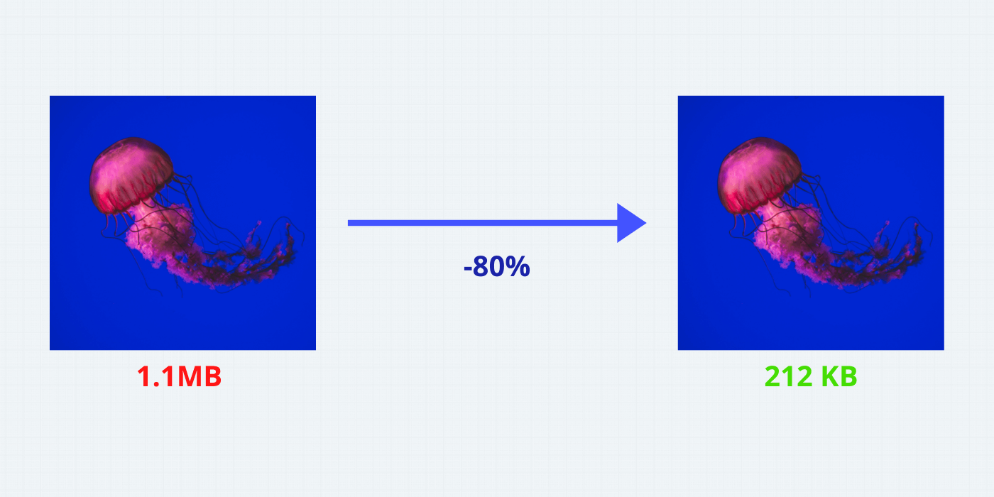
Table of Contents
What is a Webflow?
Webflow is a powerful web design platform that provides a comprehensive solution for creating visually stunning and responsive websites. Unlike traditional website builders, Webflow offers a unique combination of design and development capabilities, making it a popular choice among designers and developers alike.
With Webflow, users can build websites without writing code, thanks to its intuitive visual editor. It allows you to design and customize every aspect of your website, from layout and typography to animations and interactions. This level of control enables designers to unleash their creativity and bring their vision to life.
Highlight The Features
These features are particularly valuable for developers who want to have fine-grained control over the codebase, ensuring optimized performance and flexibility.
Responsive Web Design
Webflow is built with responsive design in mind, allowing you to create websites that automatically adapt and look great on various devices and screen sizes. Its responsive design tools and breakpoints enable you to customize the layout and appearance for different viewports, ensuring a seamless user experience.
CMS Capabilities
Webflow offers a robust content management system (CMS) that allows you to manage and update website content easily. You can create dynamic content structures, add and edit content in a user-friendly interface, and connect your content to different parts of your website. This feature is especially beneficial for websites that require frequent content updates, such as blogs or portfolio sites.
Interactions and Animations
Webflow provides powerful interactions and an animation toolset that enables you to create engaging and interactive elements on your website. You can add animations, transitions, and scroll effects without the need for external plugins or complex coding. This feature allows you to enhance user engagement and create a memorable browsing experience.
E-commerce Functionality
Webflow offers built-in e-commerce capabilities, allowing you to create online stores and sell products directly from your website. You can set up product catalogs, customize product pages, manage inventory, and process payments seamlessly. This integrated e-commerce functionality simplifies the process of building and managing an online store.
Collaboration and Hosting
Webflow provides collaboration features that facilitate teamwork among designers, developers, and clients. You can invite team members to collaborate on projects, assign roles and permissions, and leave comments for feedback. Additionally, Webflow offers secure and reliable hosting, ensuring that your website is fast and accessible to visitors worldwide.
Related article: How To Easily Move From Figma To Webflow Plugin
Understanding Image Optimization in Webflow
Image optimization refers to the process of reducing the file size of images while maintaining their visual quality. It involves various techniques and tools to minimize the file size, such as compression, resizing, and format optimization. The primary goal of image optimization is to improve website performance, specifically in terms of page load speed and user experience.
In web development, images often account for a significant portion of a website’s file size. Large and unoptimized images can slow down page loading times, leading to a negative impact on user experience. Slow-loading websites not only frustrate visitors but also tend to have higher bounce rates, lower conversions, and diminished search engine rankings.
The purpose of image optimization is to construct a high-quality image with a lower file size. Three main factors recreate a role here:
-
- Image file size (JPEG vs. PNG vs. WEBP images)
- Image compression level
- Image height and width
“Research from Moz shows that Google may specifically measure time to the first byte when it considers page speed. A slow page means search engines crawl fewer pages with their crawl budget, which can negatively affect your indexing.”
Source: Moz
Impact of Optimized Images
When images are optimized, their file sizes are significantly reduced, leading to faster loading times. This means that visitors can access the website content more quickly, resulting in a smoother and more enjoyable browsing experience.
Slow-loading websites frustrate users and often lead to high bounce rates, as impatient visitors are more likely to abandon a site that takes too long to load. On the other hand, optimized images ensure that web pages load swiftly, capturing and retaining user attention. Studies have shown that even a one-second delay in page load time can result in decreased conversions and user satisfaction.
In addition to improving page load speed, optimized images also have a positive impact on bandwidth usage. Smaller file sizes consume fewer data, which is particularly crucial for users with limited internet connectivity or mobile data plans. By optimizing images, you not only improve the experience for all users but also cater to those with slower connections, expanding your website’s reach.
Moreover, optimized images contribute to a better mobile browsing experience. Mobile devices often have limited processing power and smaller screens, making the optimization of images even more critical. By reducing the file sizes, optimized images load faster on mobile devices, preventing delays and ensuring a seamless user experience on smartphones and tablets.
Ways To Optimize Images In Webflow
Let’s explore the ways to enhance your Webflow image optimization and take your website to the next level!
Utilizing Web Flow’s Built-In Image Optimization Features
Webflow offers built-in image optimization features that make it convenient for users to optimize their images directly within the platform. When you upload images to Webflow, it automatically compresses them to reduce file sizes without sacrificing quality. This feature ensures that your images are optimized for web use, leading to improved page load speed and better overall performance.
Webflow’s image optimization process applies various compression techniques, such as:
-
- clearing excessive metadata
- decreasing color deep
- utilizing efficient reduction algorithms.
By utilizing Webflow’s built-in image optimization features, you can save time and effort, as the platform handles the optimization process for you. It simplifies the workflow and allows you to focus on creating engaging content and designing visually appealing websites without compromising performance.
Exploring Third-Party Image Optimization Tools And Plugins
While Webflow provides native image optimization capabilities, you may also explore third-party tools and plugins to further enhance your image optimization efforts. These tools offer additional features and customization options to fine-tune the optimization process based on your specific needs.
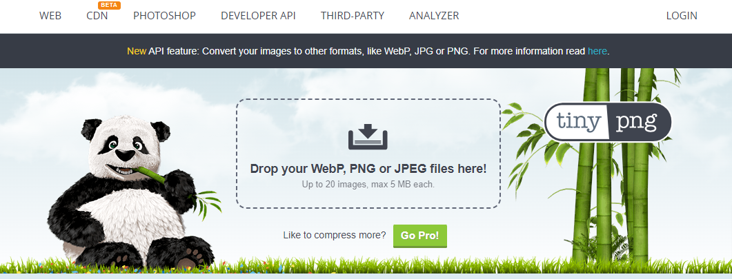
TinyPNG
One popular third-party image optimization tool is TinyPNG. It utilizes advanced compression algorithms to reduce the file size of PNG and JPEG images while preserving visual quality. By using TinyPNG, you can manually optimize your images before uploading them to Webflow, ensuring maximum compression and performance.
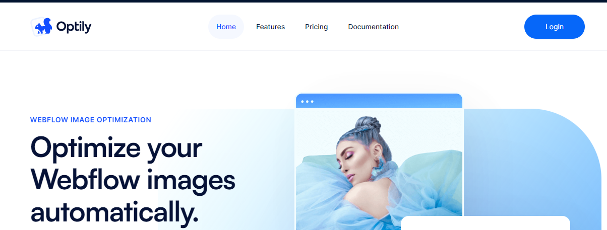
Optily
Other image optimization plugins and tools, such as Optily and AI Optimize Image, offer advanced optimization techniques, including artificial intelligence-based algorithms that analyze and optimize images for the best results. These tools often provide more control over the optimization process, allowing you to adjust settings such as compression levels and image formats.
Benefits Of Using Image Optimization APIs Like TinyPNG
-
- Firstly, it allows for seamless integration with your existing tools and processes. You can automate the image optimization process, saving time and effort by directly integrating the API into your image upload or content management workflow.
- Secondly, image optimization APIs often offer more advanced optimization algorithms and techniques. They can analyze and process images in real time, delivering highly optimized results. APIs like TinyPNG have dedicated servers and infrastructure optimized for image processing, ensuring fast and efficient optimization.
- Thirdly, image optimization APIs handle the technical aspects of image compression, ensuring optimal results without the need for manual intervention. They take care of tasks such as selecting the appropriate compression settings, optimizing file formats, and generating optimized image variants for different devices and screen sizes.
Best Practices for Webflow Image Optimization
Remember, image optimization is a continuous process. Regularly audit and optimize your images to ensure they align with the evolving needs of your website and its visitors. By implementing these best practices, you can create visually stunning, fast-loading websites that leave a lasting impression on your audience.
Choosing The Right Image Formats For Specific Use Cases
When it comes to image optimization in Webflow, selecting the appropriate image formats for specific use cases is crucial. Each format has its strengths and best practices that can significantly impact the performance and visual quality of your website.
Joint Photographic Experts Group
JPEG (Joint Photographic Experts Group) is ideal for photographs and complex images with many colors and gradients. It offers a good balance between image quality and file size compression.

Portable Network Graphics
PNG (Portable Network Graphics), on the other hand, is well-suited for images with transparency or sharp edges, such as logos or graphics. It provides lossless compression, maintaining high quality but resulting in larger file sizes.

Scalable Vector Graphics
SVG (Scalable Vector Graphics) is a format commonly used for icons, logos, and vector-based graphics. Unlike raster formats like JPEG and PNG, SVG files are resolution-independent and can be scaled without losing quality. This makes SVG an excellent choice for responsive web design, as it ensures sharp and clear images on various devices and screen sizes.

Image Size And Resolution For Better Performance
Another essential aspect of image optimization in Webflow is ensuring optimal image size and resolution. Large images can significantly impact page load speed, leading to a negative user experience. By resizing images to the required dimensions and reducing their file sizes, you can improve overall website performance.
Start by analyzing the context in which the image will be displayed. Determine the maximum dimensions required and adjust the image size accordingly. Avoid using oversized images and scale them down to the appropriate resolution to reduce file size.
Compression is also crucial in optimizing image size. Use tools like Webflow’s built-in compression features or third-party services to compress images without compromising visual quality. Striking the right balance between image size and quality is key to achieving faster loading times and a smoother browsing experience.
Implementing Alt Tags
Alt tags, or alternative text, play a vital role in image optimization for both accessibility and SEO purposes. Alt tags provide a text description of the image, allowing visually impaired users to understand the content through screen readers. They also serve as fallback content if the image fails to load, enhancing accessibility for all users.
In addition to accessibility benefits, alt tags are crucial for SEO optimization. Search engines rely on alt tags to understand the content and context of images, improving the chances of your website appearing in relevant image search results. Ensure that alt tags accurately describe the image, incorporating relevant keywords when appropriate.
Leveraging Lazy Loading
Lazy loading is a technique that defers the loading of images until they are about to enter the viewport, significantly improving page load speed. Rather than loading all images on a page simultaneously, lazy loading loads images progressively as users scroll, reducing the initial load time.
Webflow provides native support for lazy loading through its interactions and animations toolset. By applying lazy loading to images, you can ensure that only the necessary images are loaded, enhancing the overall page load speed and optimizing the user experience. This technique is particularly beneficial for websites with extensive image content or long-scrolling pages.
Utilizing CDN
A Content Delivery Network (CDN) is a network of servers distributed globally, allowing for efficient content delivery to users from the nearest server location. By leveraging a CDN, you can reduce latency and improve website performance, including image loading times.
Webflow provides seamless integration with a built-in CDN, ensuring that your website’s images and other content are delivered efficiently to users worldwide through a network of optimized servers. By hosting your images on a CDN, you can take advantage of faster loading times and improved user experience.
Techniques To Make Images Responsive In Webflow
Webflow provides several techniques to make images responsive and adapt to different screen sizes. These techniques ensure that your images look great and load efficiently, regardless of the device being used.
-
- Using percentage-based dimensions: Instead of specifying fixed pixel dimensions for images, you can set their width and height using percentages. This allows the images to scale proportionally based on the size of the parent container or the viewport, ensuring responsiveness.
- Applying fluid container elements: Webflow offers container elements with fluid width settings. By placing your images inside these containers, the images will automatically adjust their size based on the container’s width, adapting to different screen sizes.
- Utilizing CSS breakpoints: CSS breakpoints allow you to define different styles for different screen sizes. In Webflow, you can set breakpoints and apply custom styles to images at specific viewport widths. This enables you to optimize image sizes, and layouts, or even use different images altogether for various devices.
- Using Webflow’s responsive image feature: Webflow provides a native responsive image component. By adding the responsive image element to your design, you can easily upload multiple versions of the same image optimized for different screen sizes. Webflow will automatically serve the appropriate version based on the user’s device, ensuring optimal image quality and performance.
Benefits of Different Images For Mobile Devices
Mobile devices have specific characteristics and limitations that necessitate considering different images tailored for mobile screens. By optimizing images specifically for mobile devices, you can further enhance the user experience and performance of your website.
-
- Reduced file sizes: Mobile networks often have slower speeds compared to broadband connections. By optimizing images for mobile, you can further compress the file sizes, reducing the time it takes for them to load on mobile devices.
- Smaller dimensions: Mobile screens are typically smaller than desktop screens. Therefore, using smaller image dimensions for mobile devices can help conserve valuable screen real estate and ensure that the images fit well within the layout.
- Alternative image formats: Depending on the device’s capabilities, you may consider using different image formats specifically for mobile devices. For example, using WebP or JPEG 2000 formats can provide better compression and faster loading times on certain mobile browsers.
Conclusion
To achieve the best results with Webflow image optimization, we encourage readers to implement the discussed practices. By incorporating these techniques, such as choosing the right image formats, optimizing image size and resolution, implementing alt tags, utilizing lazy loading, and leveraging CDNs, readers can significantly enhance their website’s performance, user experience, and accessibility.

 & Passion.