
What digital strategy you are going to use in 2021 needs compelling strategies for sale page designs. It’s because of greatly affects your website conversion rate.
The key element to deriving your website’s conversions, the page designs, should be optimized, influencing the customers to uplift the sales. Thus, the companies put great effort into creating such content that attracts the leads using research data. Therefore, practicing the design guides and trends, the majority of websites look the same.
Keeping this in mind, the brands that want to create a big difference have to invest time and effort in page designs. It comes through innovation, ideas, creativity, and experimentation.
Table of Contents
What Is Sale Page Designs?
A page that turns the leads into the customers is a sale page, and the element that persuades the visitors to take action is sale page designs. It tells the visitors about the product that you are selling. The page designs either impact the sales positively or negatively. A well-design page layout always brings positive outcomes.
Why Need Sale Page Designs
Designing a page for sales should be simple, easy to use, and read. The first thing that inspires the user is the design page. It designs with a purpose that what you want to sell. Hence, it is crucial to create an attention-grabbing page that entices visitors to buy and increase sales.
Marketing Tips For Sale Page Designs
While creating such pages, always place yourself as a customer if you browse a site what you think it should be. What questions will come to mind as a user?
Now, discuss the different tips that make you design a page to increase the sale.
1. Define The Goal Of The Sale Page Designs
The web page that has no goal defined impacts negatively on the user’s mind. While creating a page, it is necessary to ask yourself about what people you want to target. Why and how it could help the audience. And practicing these guides will help to keep in the right way. So, it’s better to have goal-oriented sale page designs rather than haven’t.
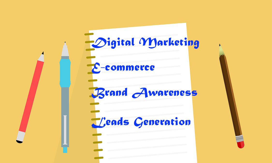
You can design a page depending upon the goal with your preferences. And it may include:
Digital Marketing:
The goal is to grow your business by providing digital marketing services to customers. That’s catching the leads by outreaching and building strong connections with the people.
Brand Awareness:
With the email campaign, you grow the subscribers’ list by developing relations with them, providing brand awareness and product or services. As a result, it will grow the customers.
E-commerce:
Such landing pages serve for online shopping. It also helps in branding, growing the customers, and boost sales. That’s helping the customers buying the products and services on one platform.
Leads Generation:
It’s the contact information approach to the people for the products or services offering the company and getting the leads growing the sales.
Thus, defining the goal is vital as it directly influences the page designs. So, you can practice your design goal in 2021.
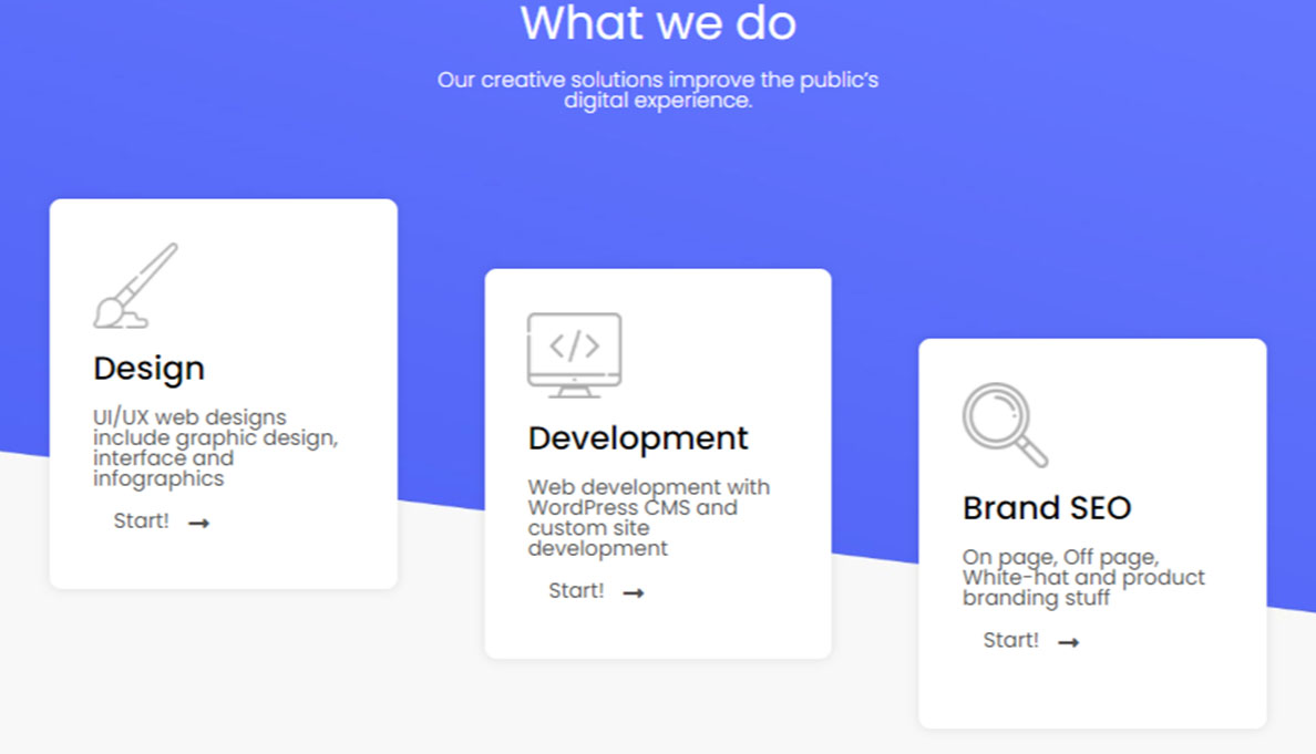
2. Design A Layout Plan
Besides the goal, you have the page’s layout design, making the work easier and proceeding step-by-step. It not only helps to catch the customers but also generates leads, uplifting the sales.
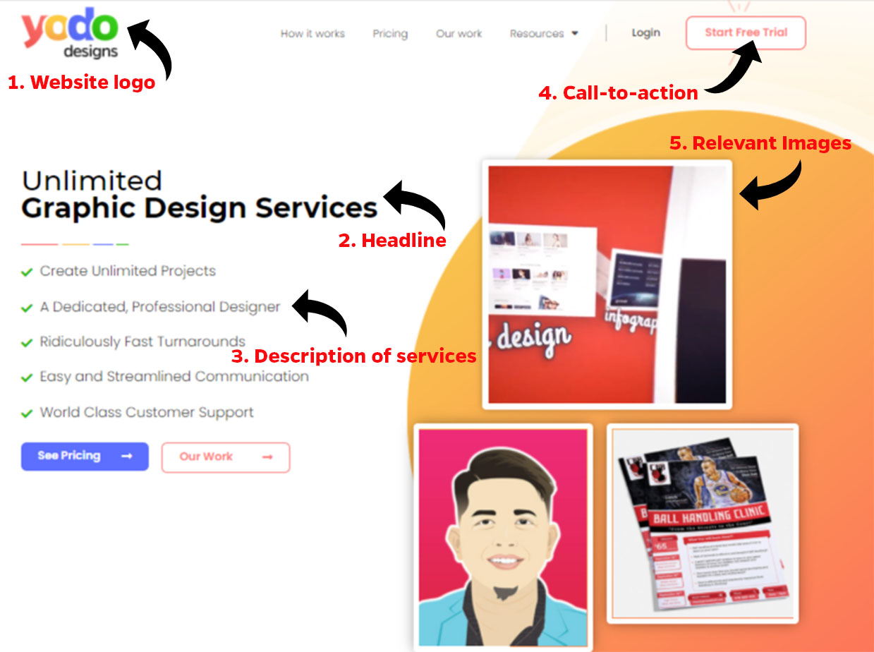
The key elements that must be part of the page design include:
- Website logo
- Headline
- A brief description of the services
- Call-to-action button
- Relevant image
- Lead capturing form
3. Keep The Sale Page Designs Concise
While working on the design page’s key elements, focus on the heading and description, making it easier to understand. Explain stuff in plain language so the user can grab the information. Besides, it is highly effective for SEO, loading times, navigation, and user experience.
Researches show the average span of the user is only eight seconds to stay on the website. Therefore, it’s better to describe the brand or service offering in simple words and briefly. Why and how the services or brands can be beneficial for the customer focus in plain words.
No doubt, sales page designs work greatly in lead capture but ensure the availability of information and customer priority at first. That’s a key thing that will attract the customers turning the sales high.
Isn’t it good?
4. Above-The-Fold Positioning
Ensure the important information and call-to-action button at the top of the page so that the visitors who want to buy or learn about what you are offering can click on the CTR button without scrolling down the page. It’s not meant that the user will not scroll down the page; it might be possible the user is interested in the offers coming through a connection or link. And the user is not visiting the page for the first time. Keeping above-the-fold reduces the chances of the minimal scrolls once you get the conversions.
While keeping important information at the top does not mean neglecting the users who scroll down the page. The best practice is to place the call-to-action button at the regular intervals below-the-fold also, so it is actionable. In this way, it will grab more attention and learn the user’s rest of the information.
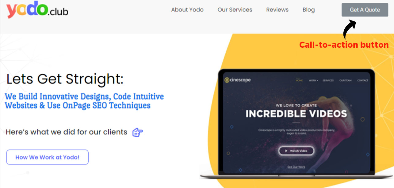
Here, you can see the CTA button at the extreme right position of the landing page.
And it can be great for your sales in 2021.
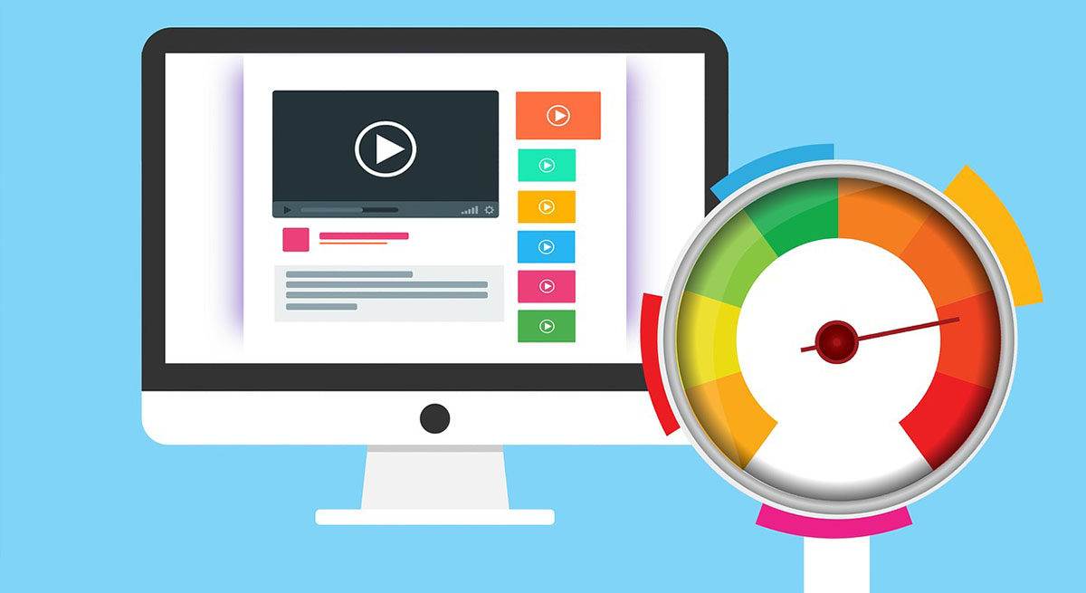
5. Use Of Visuals In Sale Page Designs
The best practice that helps the user to understand the idea of the page is to use visual elements. As said before, people scanning duration is only eight seconds that is enough to extract the idea. Inserting images in the content not only makes it easier to read but also attracts attention. Images are easier to read than the text.
While using imagery elements, it should draw attention and go with the page design.
Video explanation is another good thing that really works. You can easily define the difficult text through videos and see the difference in a video. Using the visual elements in marketing can boost your conversions. It’s a good practice to use relevant videos in the design.
6. Keep The Visuals Elements Optimize
Whether to use images or videos, make sure all should be user-friendly and SEO optimized. Low resolution and large images look blurry and increase the loading time affecting the site. Always use high-resolution and small images.
Besides, keep the video short and use good content as people avoid seeing the longer videos that take time to load. So, for engaging the audience on the page, optimize the visuals for users. As a result, it will look good, easy to use, and navigate on the devices.
7. Distraction And Exist Free Design
If you want to remain the people on your web page, it is good to remove the navigation bars—links or related offers that cause the people to move from one page to another. As you want the visitors solely on your website generating conversions, it’s better to limit the existing and distracting opportunities. This will be ultimately beneficial for your sales.
It does not mean to neglect all the links that keep the users busy on the site but only limit navigation. So, visitors can focus on the product or services offered. You can add below-the-fold or exclude entirely as the marketing companies do.
8. Engage With Enticing Offers
Once you are done keeping the website user’s focused on the page, you should add attractive offers to get high conversions. Believe it will engage the customers and persuade them to click on the offer. Because it’s human nature, people attract to the brands offering discounts or free trials. But services or products must go with the content.
How can you do it?
The simple way is by creating a lead-capture form mentioning the visitor’s email address, first and last name. In doing this, you can provide them with offers or discounts about the brand. Depending upon the goals, the form initials may change. It also needs to convince the user’s that your services are worthy.
9. Engaging Call-to-action Button
The CTA is the button that makes the visitors click on the subscription after completing the personal information. As more people will click, the higher will be the conversion rate.
Make your call-to-action button using words that entice the audiences and drive to the website. While designing CTA, it must stand out from the rest of the text. The font and size of the CTA should be larger than the descriptive text but not too much larger as it merges with the landing page.
Your CTA reflects the conversion rate that causes the visitors to act. It impacts your brand, making the website’s visitors actionable. It must go with the page fonts and contrasting colours, generating the conversion.
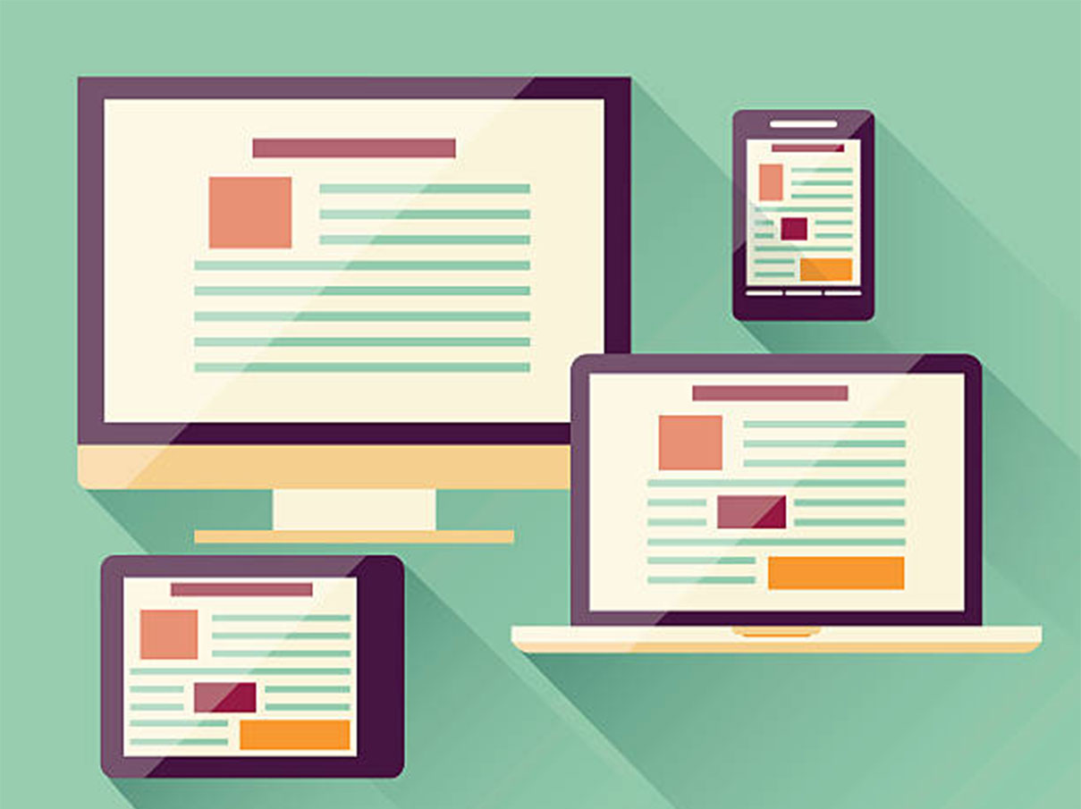
10. Make It Responsive For Mobile Devices
Most users prefer to browse on smartphones for ease of use rather than laptop or computers as mobile devices are easy to carry and cover less space than heavy devices. And some people have only phones for their working. So, you need to maintain the functionality of the page on the devices as well. That’s why it will look clean and the same on the phones as desktop.
If the page design is such that it causes to open improperly, affecting its functioning will negatively impact sales. And the visitors will turn away to a good site. Your page elements and size as well should look the same as on the desktop.
11. Optimize The Loading Time
According to the researches, the average visitor span on the website is 0.8 seconds. The people avoid reading the text but only scan the information. Make sure that the page takes less time to load. Images, videos should open within seconds. Navigation links and buttons should work properly.
And how can you do it?
Keep the sales page design minimal—Short down the span of the videos. Use the JPJ images rather than the PNG file. No doubt the quality of the PNG file is better, but it reduces the load time. Avoid unnecessary stuff.
12. Exclude Choice Paralysis
Choices with too many options make the customer unable to select the best option. The customer becomes confused about not understanding the right selection. The customer consumes more time in the selection process, and in the end, they leave the product or services. That’s the choice paralysis in marketing.
When your customer has many choices, they become paralyzed. Therefore, we should consider it in the page design.
Always reduce the chances of choice paralysis. Present the customer with the right choice. Suggest which option will work best for the customer. Make it easier by telling which will be beneficial for them. As a result, the customer will choose the right and no choice paralysis.
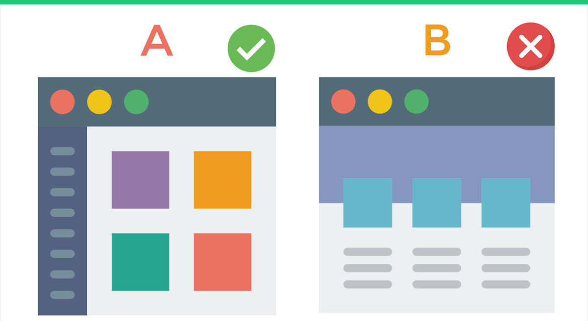
13. Make Strategy To Test The Conversions
After crafting a design page using key elements, now, it’s time to plan an A/B strategy to test which landing page design generates high conversions for you. As a result, you can review the performance of the page and what can make the difference. It’s important to test the strategy of one page at a time. Otherwise, you cannot analyze the difference.
Please optimize it for search engines with less loading time; otherwise, it impacts the conversion rate negatively. A/B testing will lead to what changes impact the conversions whether you should proceed with the new changes or keep the previous one.
Wrap Up
We hope all tips will help you in creating a killing design page for sale. That does not mean your webpage can have only these things. You can design a page with some more creative ideas. This article provides guidelines on how you should make a start.
Let’s start and turn the lead into a conversion.
Frequently Asked Questions
1. How do you design a sale page?
Answer: The page designs with a purpose in mind to turn the lead into conversions by an overview on basic things.
- Know the audience.
- Keep things simple and concise.
- Headline and description grabbing the attention.
- Keep the words simple.
- Describe the product that persuades you to buy.
- Tell the audience how they get the benefit.
- Build brand trust and credibility.
- Come up with the best offers that customers can’t refuse.
2. Will the sale page generate the desired outcomes?
Answer: It is important to build brand credibility because your end product is your customers. And, the people love to buy and sell the brands they liked. However, it requires time and effort to gain the desired results. A/B strategy works to review the changes that cause the leads to increase.
3. What does the sales page define?
Answer: The sale page is the page that defines the product that you are selling. It is made by keeping purpose in mind to enhance the sales. What product or services you sell can differ depending on goals, but the purpose can’t, and it’s only to grow the conversions.
4. How can we make a sale page that works really?
Answer: A well-structured design of the sale page is one reason that attracts visitors. Hit the audience using the CTA button that stands out and headlines to convert the visitors into customers. A/B strategy to test changes.
5. Why is a sale page necessary?
Answer: Securing the sales means making the sale page that entices the visitors to come on the page. It’s a product or services page that can’t make the people refuse and turn them into customers.

 & Passion.